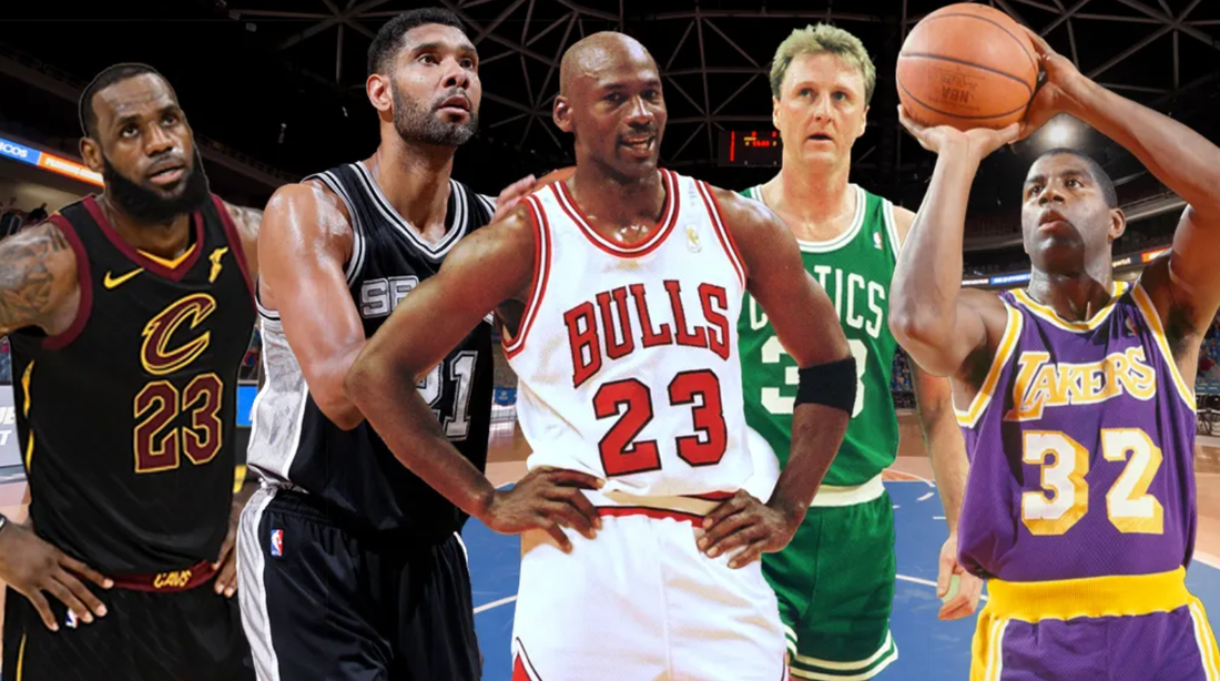
Everyone has their own list about Top 10's in different sports, everyone has their own Top 10 in the NBA, but this is my list and I don't base anything on hatred of players because I know a lot of people do that. That their lists show massive bias because they hate guys like LeBron or Kobe or Shaq or whoever. When all is said and done, I'm fortunate to have been able to watch the two eras of basketball I was the 90's era and current era; it has been extremely enlightening to see some of the greatest ever players. I never got to see all of them of course, Kareem, Bird, etc but I know how great they were.
Here's my list and we start with the GOAT.
Here's my list and we start with the GOAT.
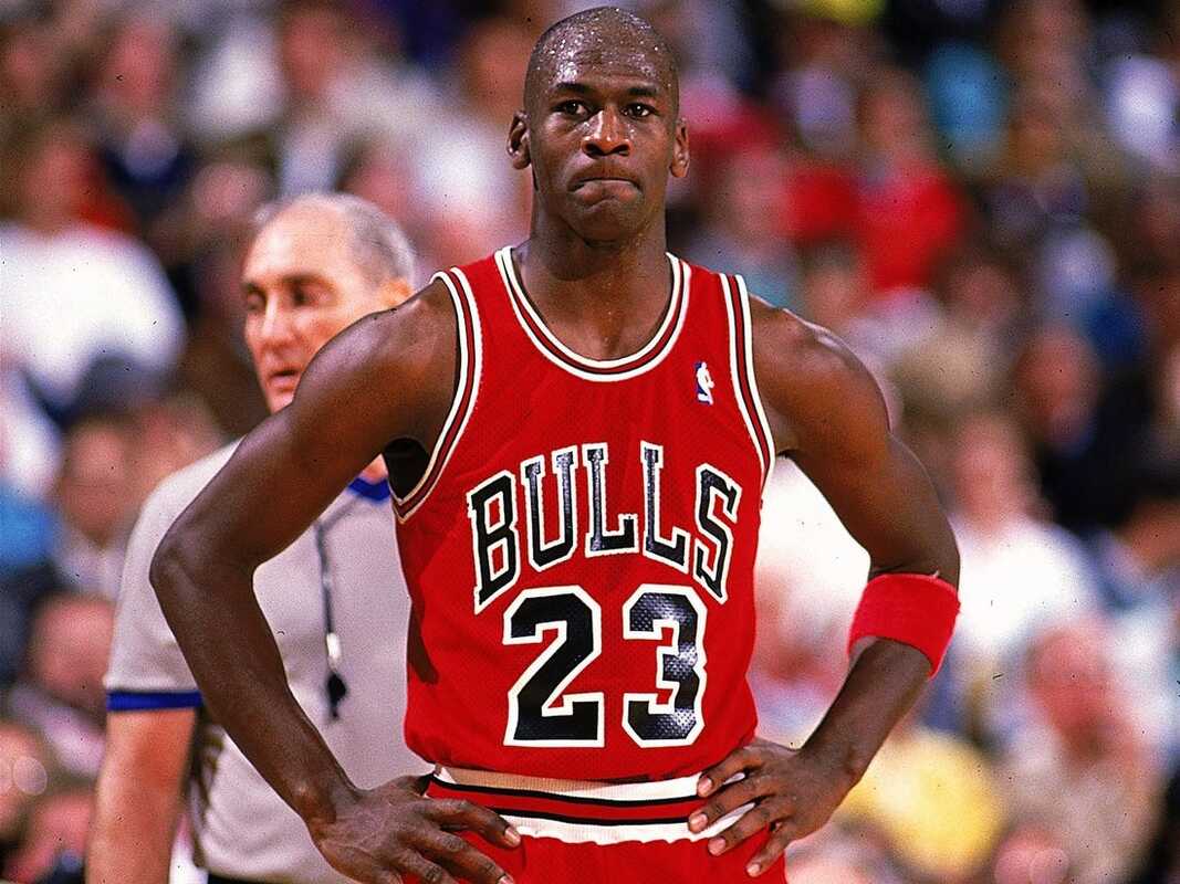
#1) MICHAEL JORDAN
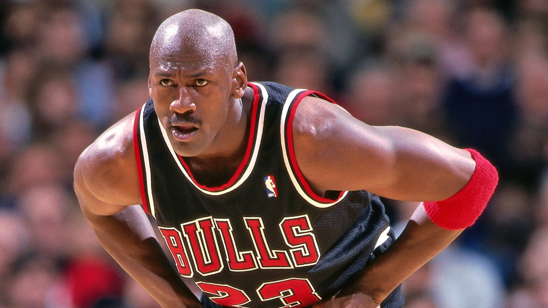
I constantly would debate back and forth between others and myself, who do I consider to be the GOAT, who's better MJ or Bron? Well it boils down to something simple, MJ was the most dominant player on the basketball court ever. You can't say most dominant of any era, because that's an insult to guys before and after him that were the most dominant of theirs. However, he was the most dominant player ever to step foot on the court. Sure there were times he was outclassed by guys like Magic, Bird, Isiah, but when it came down to it he won no matter the cost. He was a win at all costs type of player and to him, nothing else mattered. He alienated a lot of people that way but he didn't care at all. His own teammates he treated like absolute dog shit but it was because he wanted to win, while I don't agree, that's just how aggressive MJ was. He was also the first player to start a brand: Air Jordan went on to become a billion dollar brand and paved the way for the guys today to get shoe deals and start their own shoes. MJ was a trailblazer in that regard and honestly my only knocks on him are: that he was a bully, he had a massive gambling problem, and of course coming back and joining the Washington Wizards. Oh and I suppose everything he's done as owner of the Charlotte Hornets.
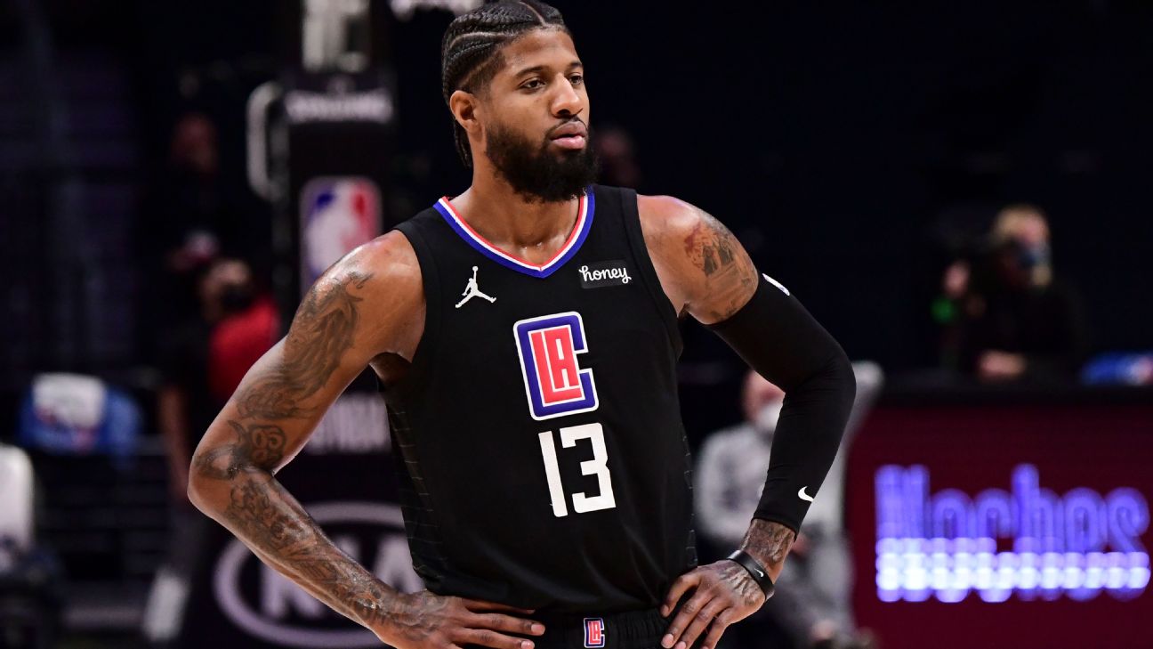
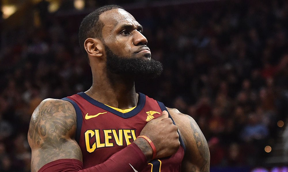
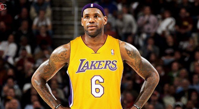
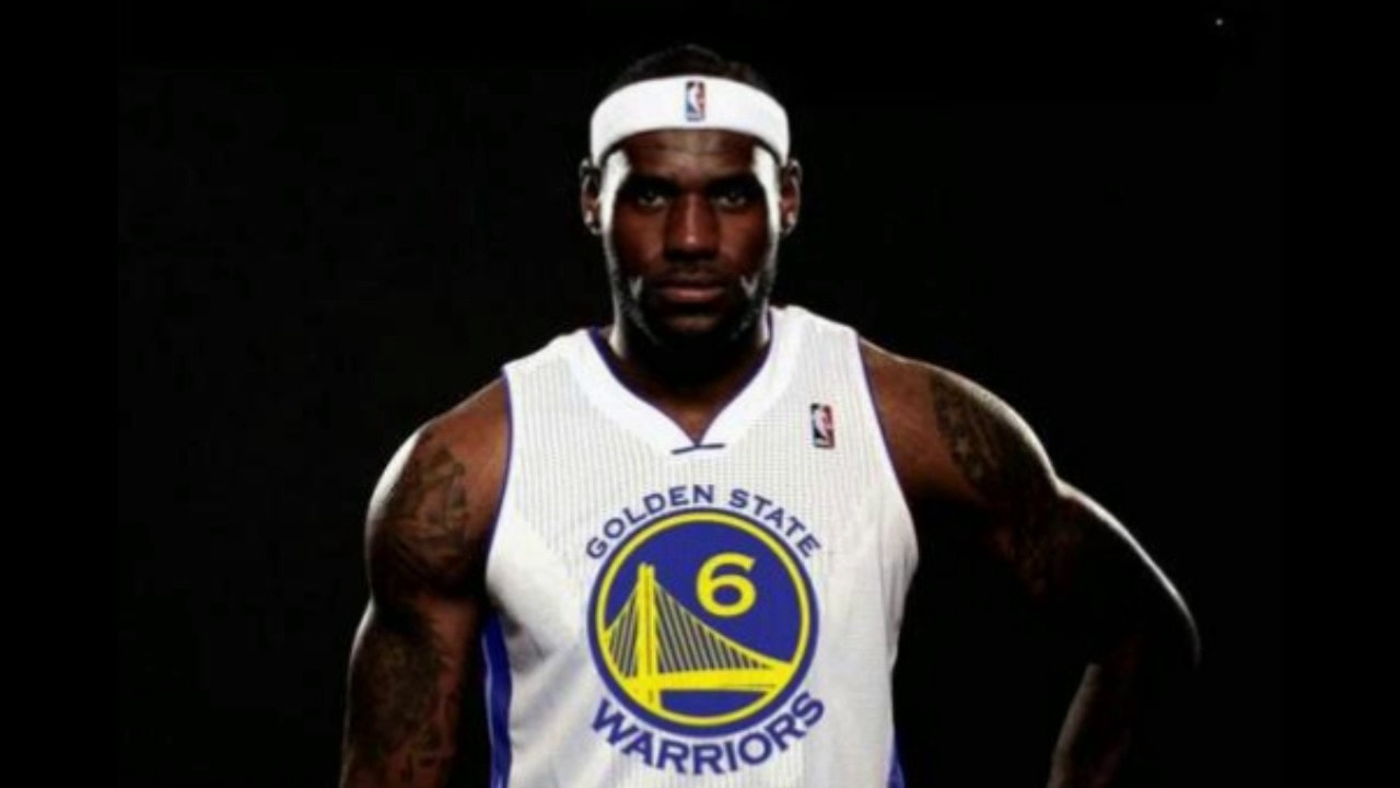
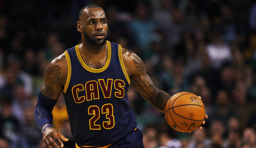
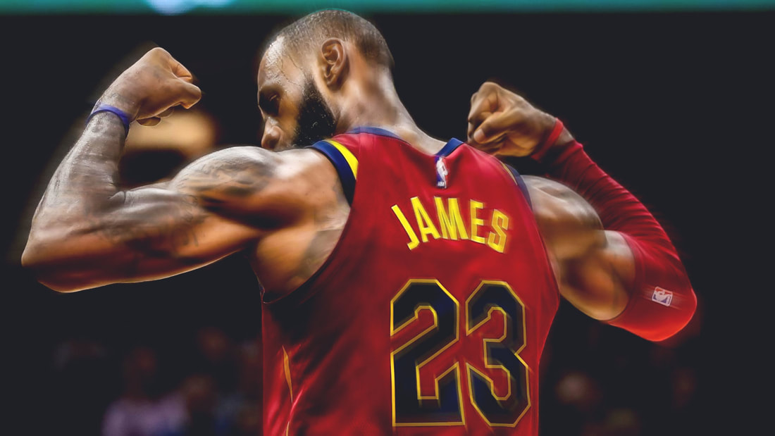
#2) LEBRON JAMES
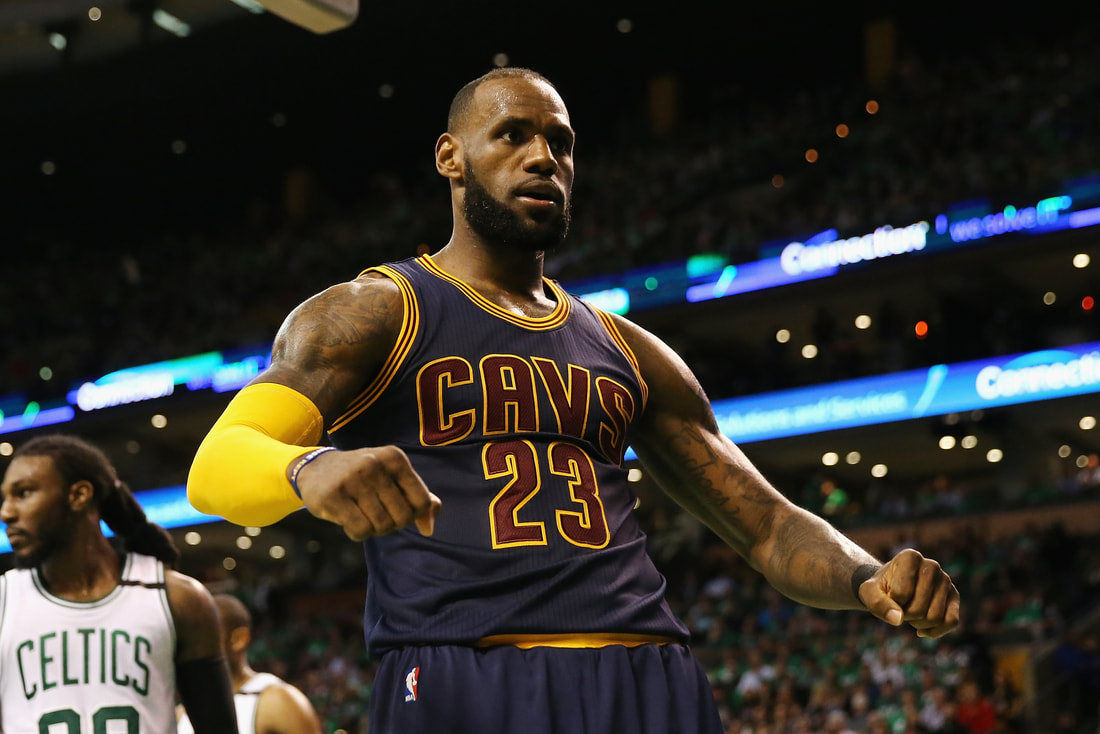
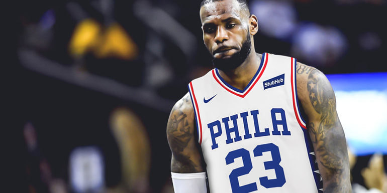
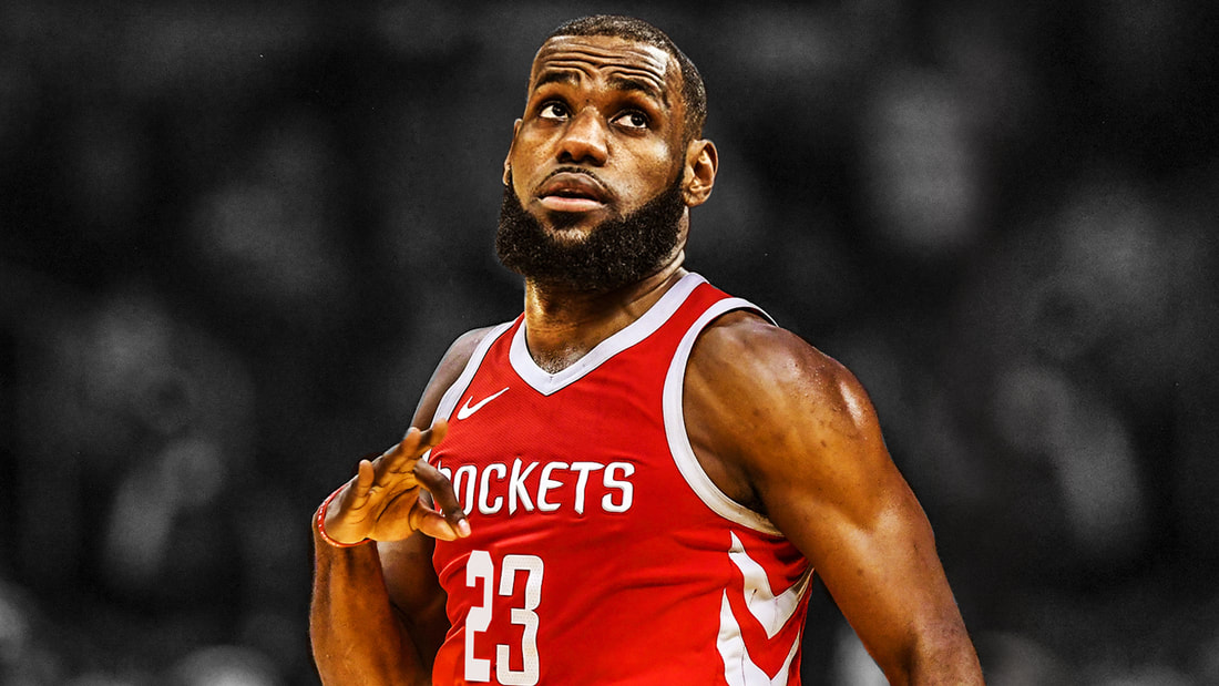
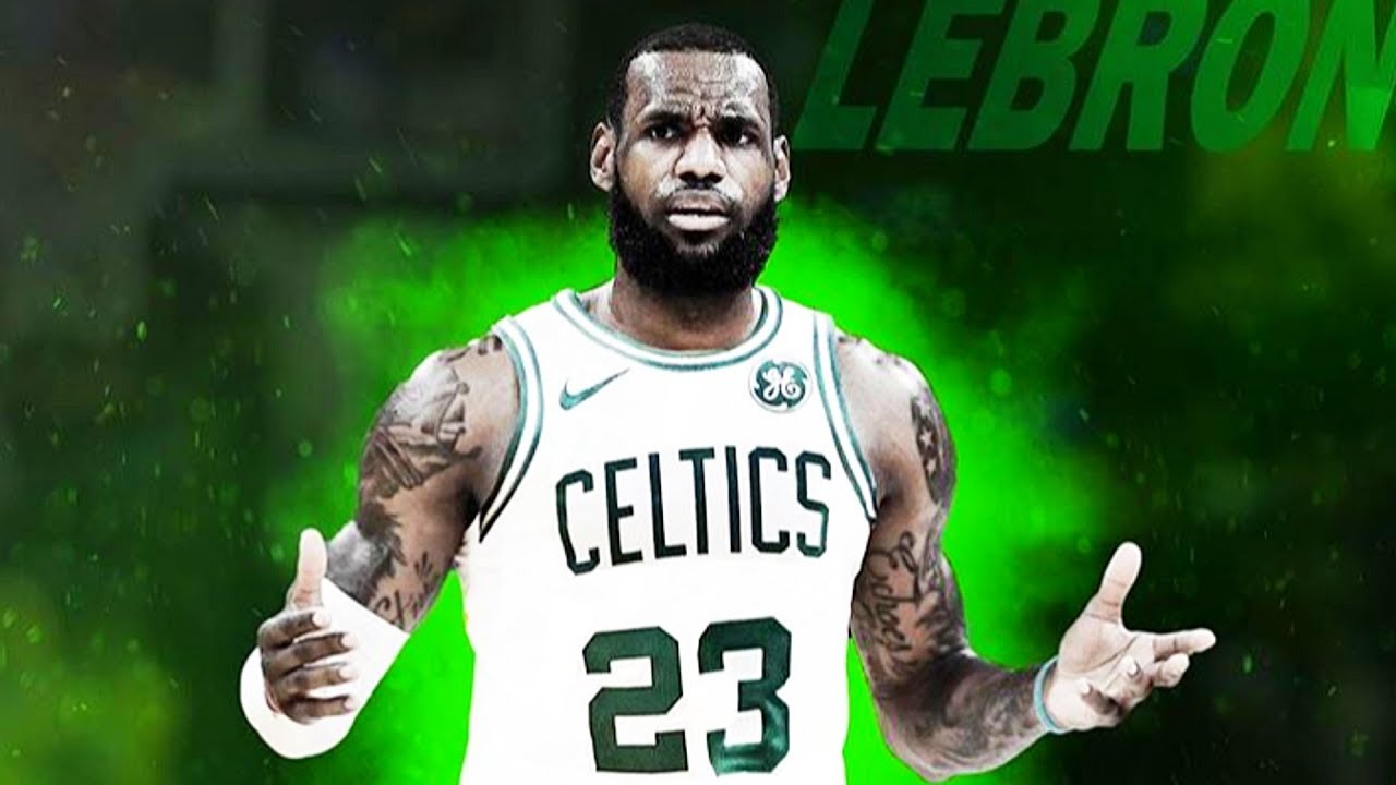
When you are mentioned in arguments and conversations between yourself or Michael Jordan as to who the GOAT is, you've cemented your legacy as one of the most dominant to EVER step foot on the basketball court. The NBA's All-Time leading scorer, someone who is near the top of every statistical category, King James is exactly that a King. I've come to understand that he is indeed second to MJ however there is no denying that he is #2; make whatever weak-willed, pathetic argument you can but with all of his statistical accomplishments, his career accomplishments, his leadership, his charity work, his drive to be the best, he's exactly where he should be. LeBron was a phenom and kid coming out of high school, came into the NBA full of grown men, and carried an absolutely GARBAGE Cleveland Cavaliers team to the NBA Finals. In fact, he carried a consistently garbage Cleveland Cavaliers team to the playoffs every year despite his owner refusing to make the team better, then as a free agent he decided he couldn't carry a bunch of bums forever and left to play in Miami. LeBron was CRUCIFIED because he went to play in Miami with Dwayne Wade and Chris Bosh; "oh he's building a super team, a super team, he can't win alone, what a joke, etc". A kid spent years taking a perennially terrible team to the playoffs; a team where his next best teammates where Zydrunas Ilgauskas, Carlos Boozer, and an aging sad version of Shaq. Then he's raked over the coals for going somewhere during free agency, including his old owner Dan Gilbert (the one who refused to better Cleveland even before LeBron got there). Despite that, LeBron has been on 3 teams and brought each one a championship: the Cleveland Cavaliers, Miami Heat, and Los Angeles Lakers. He takes more heat then any other superstar in basketball history but always be able to clap back because he is that great and his play shows it. Unless you're name is Skip Bayless or a guy I work with, or internet trolls, you've got to recognize that he is the best to lace it up after His Airness.
#3) KAREEM ABDUL-JABBAR
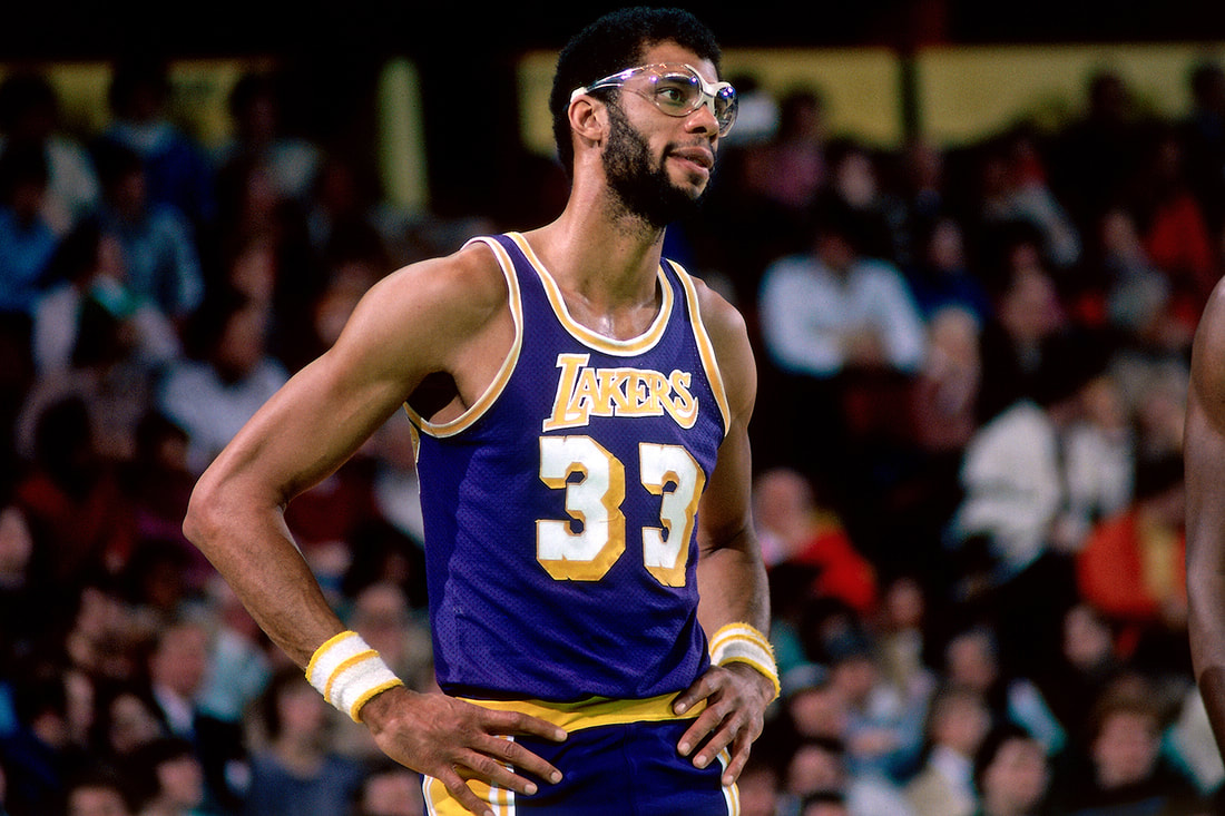
The unstoppable Sky Hook, until LeBron recently took it he was the highest scoring player in NBA history, a multi-time champion and some people have made the argument that he is better than MJ and LeBron (though it's a hard argument for me to get but I understand). Kareem along with Oscar Robinson brought titles to a dominant Milwaukee Bucks team in the 70's and then headed to the bright lights and became a part of the Showtime Lakers. I'll always see Kareem as someone who was as dominant as he was and that he is that important to basketball history, though unlike MJ and LeBron I was never able to see him play on television. Between his unstoppable shot, his ability to stop anyone he wanted, and so much more he is obviously the 3rd best player ever; it's hard to say that he's better than the other two because there's no evidence behind it to say he's better but Kareem is all-time.
#4) "MAGIC" JOHNSON
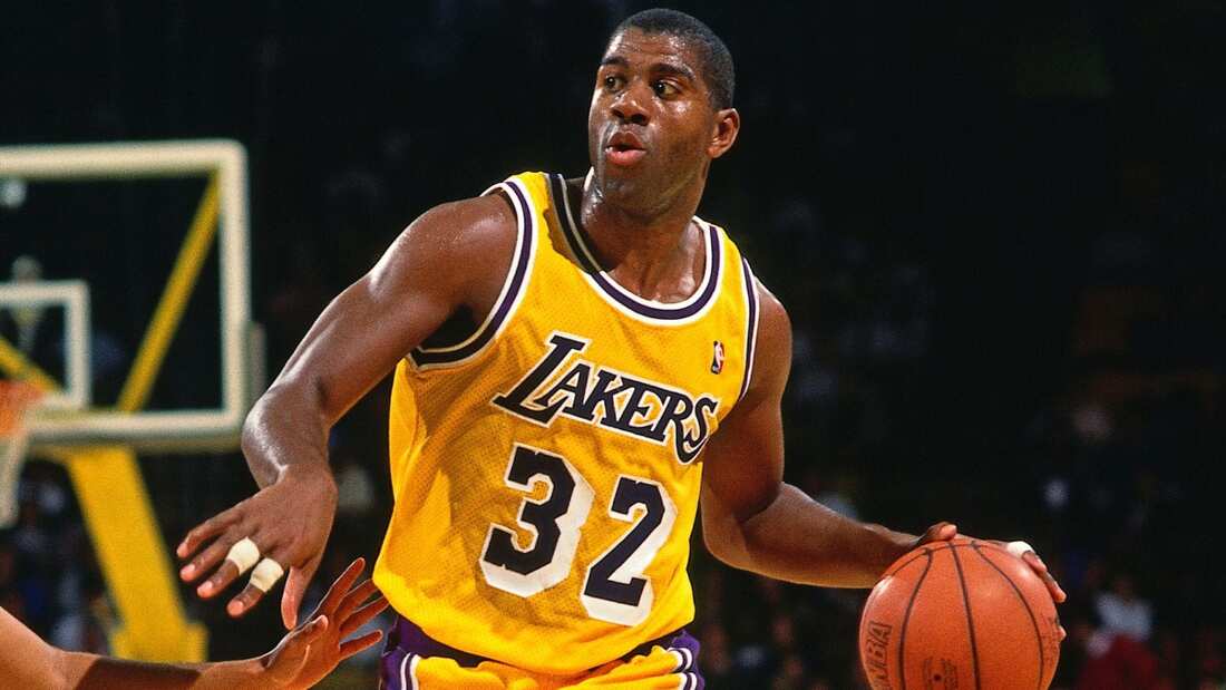
Magic Johnson was the reason the Showtime Lakers existed, he was flashy, he was out there, he was a personality, and he was a winner. Dominant in all facets of his game but particularly passing, Magic was able to generate so many assists because he had the most impressive court vision quite possibly ever; the only person close to Magic in terms of assists and court vision is LeBron. He could score, he could assist, he could do anything he wanted. There's a reason that Earvin Johnson earned the nickname Magic, like to the extent that no one calls him anything but Magic Johnson, is he was just that on the court he was magic. His battles with Larry Bird in the playoffs were legendary, his entire career was amazing. One other of the court thing that impresses me about Magic is that when he found out that he was HIV positive, it was during the AIDS pandemic, and everyone looked at him sideways because of it. He managed to show that not everyone with his immune deficient disease had "problems" and that they were able to live normally; he became an inspiration to those who didn't even know him through basketball.
#5) LARRY BIRD
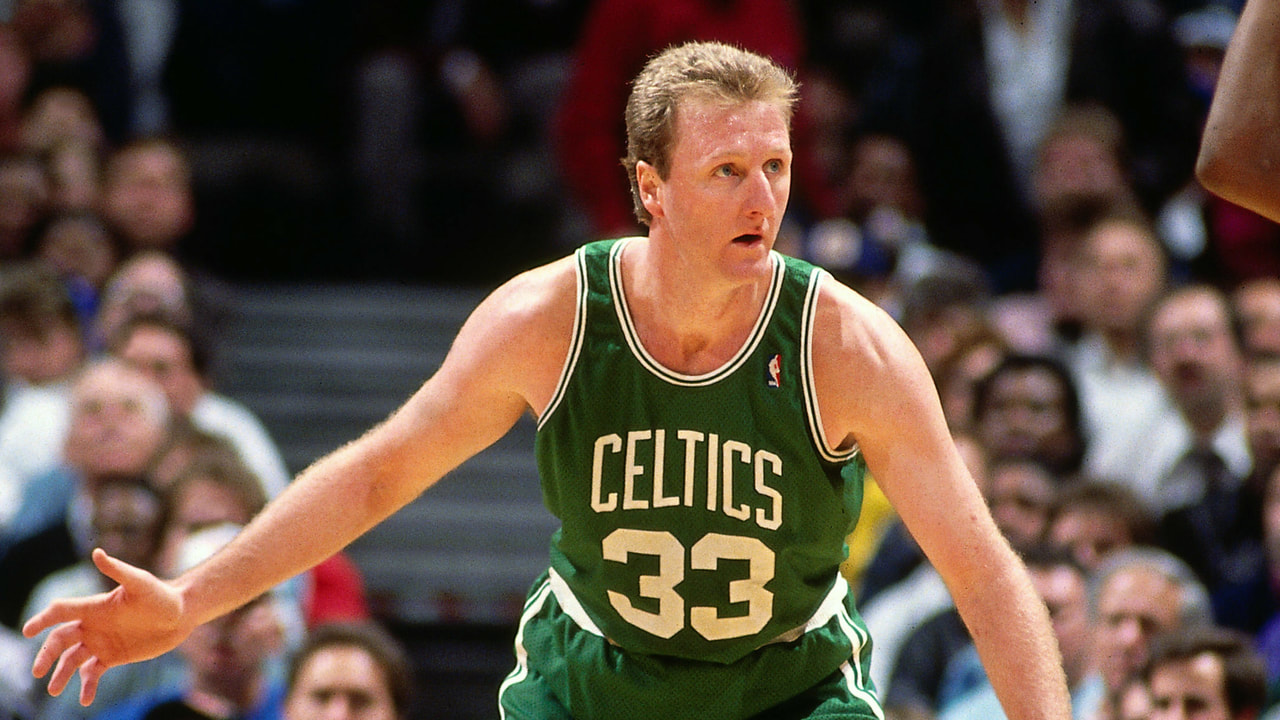
Uncontested that Larry Bird is one of my All-Time Top 10, the Celtics teams he led in the 80's were some of the most dominant teams in history. Bird was one of the first to get how important 3 pointers could be, Bird was a great defender, a great scorer of the ball, Larry could do just about anything. To me the most impressive thing about Larry Bird is that there was 3 people he was able to keep in check and make sure no one got past Boston: Michael Jordan, Magic Johnson, and Isiah Thomas. Larry was a force on the court and honestly if you can contain 3 of the best, you are one of the best ever, when you think Boston Celtics the first thing that comes to my mind is #33 the lanky kid from Indiana.
#6) SHAQUILLE O'NEAL
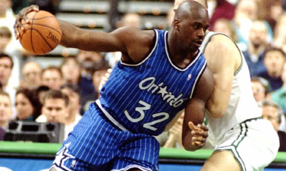
The greatest center in the history of basketball. Period. A lot of people could say "but you have Kareem at #3" well the thing is that while Kareem due to accomplishments and his play was above and beyond I don't see him as a typical center. Shaq was a typical center but at the same time he wasn't; what I mean to say is that Shaq single-handedly changed the game while being a typical center. The Diesel was unstoppable, he broke backboards, bent nets to the point the NBA had to start re-enforcing nets for dunking, and was just a force. I've said unstoppable before in this article but legitimately, Shaq was a monster, he truly was unstoppable; if Shaq wanted to score then he was going to score. The only problem Shaq ever had was with free throws, hence why people started to "Hack A Shaq", send him to the line and it was a bad time. Shaq was the reason the Orlando Magic were always playoff or finals bound, Shaq was the reason the LA Lakers won their first two titles upon his arrival, Shaq provided monster support for Dwayne Wade on the Miami Heat's first title run. The only problem with Shaq was he DID NOT take care of himself, if he did, if he ate better and worked out more he could've been better longer. Shaq did have a long career, too long near the end because the stints with the Cleveland Cavaliers, Phoenix Suns, and Boston Celtics were embarrassing honestly. But like I said, he could've been better longer then; Shaq had the potential to, with his production rate, have gotten closer to Kareem in terms of points and while not beating the record he would've been closer. Shaq even recently admitted that himself. I've always seen Shaq as this massive force and one of the NBA's All-Time greats.
#7) TIM DUNCAN
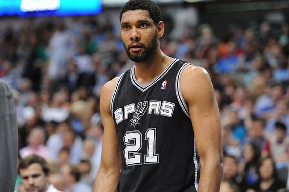
Simply put, Tim Duncan was the best Power Forward in NBA history. You could make the argument for others sure, but no one had a longer career that was constantly productive, even up until his final season putting up amazing numbers and shutting down the other team. Tim Duncan was a complete player, an amazing player, on a team with Tony Parker, Manu Ginobili, Kawhi Leonard, and at one point David Robinson; that man stood out. Timmy Duncan was never phased by anything, at all, he had people constantly trash talking him but then they realized, "this doesn't work on this guy". The most mentally tough, physically dominant power forward to ever play the position. There was no doubt he was making this list for me.
#8) STEPH CURRY
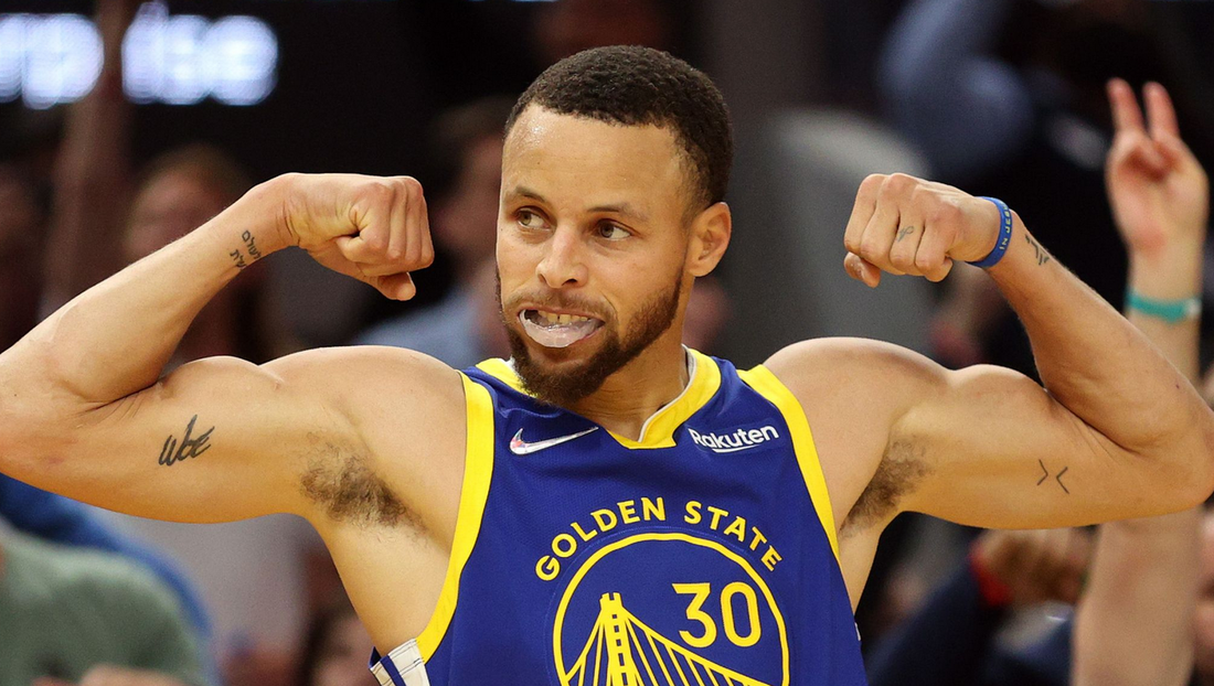
Steph Curry cracked my All-Time Top 10, pushed himself ahead of Kobe and Mr. Russell and pushed Wilt out of my Top 10. Why you ask? That's incredibly simple. Steph Curry MADE the modern NBA, he literally changed the NBA forever. The 3 point shot was never important in the 70's, 80's 90's, hell maybe even the early 00's; Steph made the 3 point shot matter, he was sinking them like no one else before him and from ranges that no one else was making before. Due to this, the Golden State Warriors were winning by wide margins due to his ease getting 3's but soon that changed. Now, the 3 ball is one of the most important things in basketball, from the moment young kids step on the courts now they don't want to do layups they want to be able to hit 3's like Steph does. He started a dynasty team in Golden State, the first unanimous MVP in NBA history (been one a few times), won a bunch of titles, won a Finals MVP and was robbed in his first title win of the MVP. Steph made my Top 10 because he's THAT good and he shaped the modern NBA.
#9) KOBE BRYANT
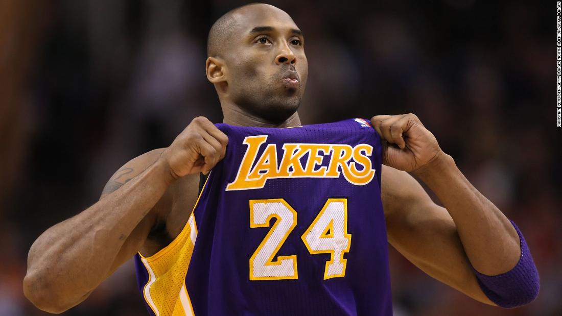
One of the greatest to lace up a pair of sneakers and someone we definitely lost too soon and in such a tragic fashion. I want people to know that there is no bias and it's not just because for the longest time I hated Kobe especially during his "sexual assault allegations"; no that's not why he's at #9 for me and not higher when many people might put him there. To me, Kobe is my #9 because even though Kobe was so good and was so dominant for such a long time he was never someone who changed the game; he was always a lesser version of someone else. That's a harsh thing to say but Kobe was always a lesser Michael Jordan, he modeled his game after MJ but it just made him seem like Mike and he wasn't. Shaq was the most dominant Laker on their championship team. Then when LeBron started playing LeBron at his young age was better. Kobe was amazing, great scorer, great game in general, and the numbers he put up were incredible; he'd be much higher if he changed the game to me and he didn't quite. He made people afraid of the Black Mamba but he never 100% changed the game, he'll always be the face of the LA Lakers though no matter what happens.
#10) BILL RUSSELL
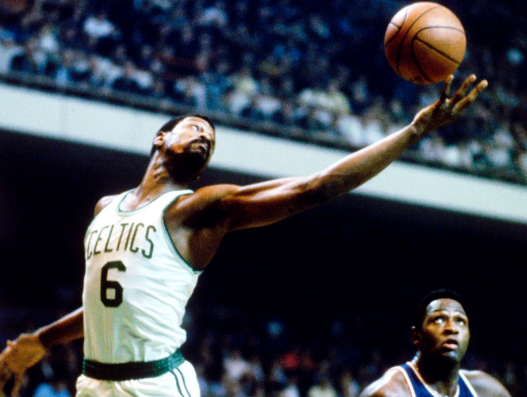
Mr. Russell is one of the greatest players to ever play, I was weighing hard between him and Wilt Chamberlin as to who was my #10, however I feel that it's Mr. Russell because he was a more complete player. You could say it's because he has 12 NBA Title rings, but if we just go by titles, he's technically the GOAT; problem with that is he was on a Celtics team with well essentially 5 or 6 other Hall of Fame players and the NBA was entirely different when he played. Ya, his completeness and willingness to not just stat pad is what puts him over Wilt to me. The other thing is, and this is the reason many including myself refer to him as Mr. Russell instead of just Bill Russell is because he deserves a lot of respect, he fought for and is STILL fighting for civil rights. He's a great human being and great basketball player and I'm sure there will come a time when someone dethrones him from my All-Time Top 10 like how Steph moving into it pushed Wilt out; but for now Mr. Russell is the last of my All-Time Top 10 NBA players ever.


 RSS Feed
