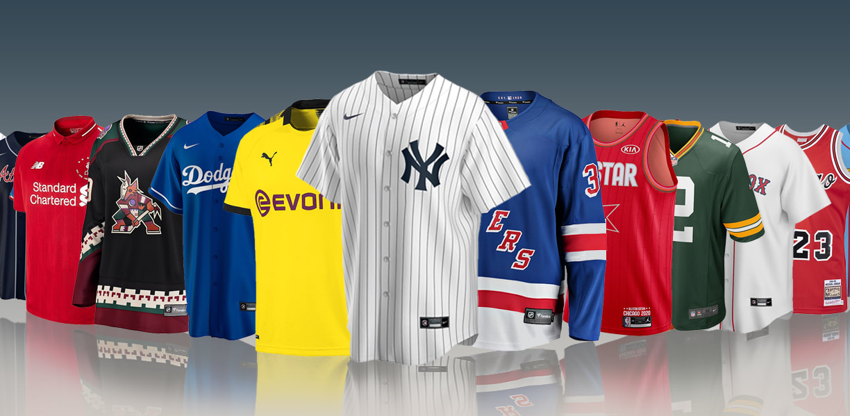
I find that jerseys are something that is integral to each sport they are a part of. Each teams, heart, soul, and true identity can be seen within their jerseys. That being said, if a jersey looks awful a team could across as worse than they may be or vice versa a really great look might mask a really bad team. So that's what I want to talk about, nice and ugly, my Top 10 Best and Top 10 Ugliest jerseys in the respective leagues. I'd like to also cover the NCAA and maybe different leagues that fall under FIFA but I won't simply because it's already daunting enough to cover the 4 big leagues: the NFL, NHL, NBA, and MLB. Just know that there are a lot of jerseys that fit in other leagues that I love and hate, there's also a lot of jerseys that I love and hate that don't make this list even but they should. Also when they are listed, they aren't in any specific order, like there's no best to least best and ugliest to least ugliest; nah, it's just #1 to 10 of ones I like and think are ugly.
Here we go.....................
Here we go.....................
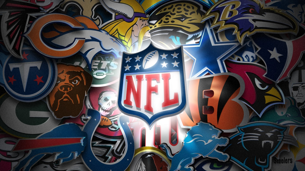
THE NFL
MY BEST 10 - NO SPECIFIC ORDER
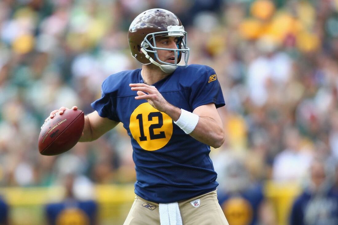
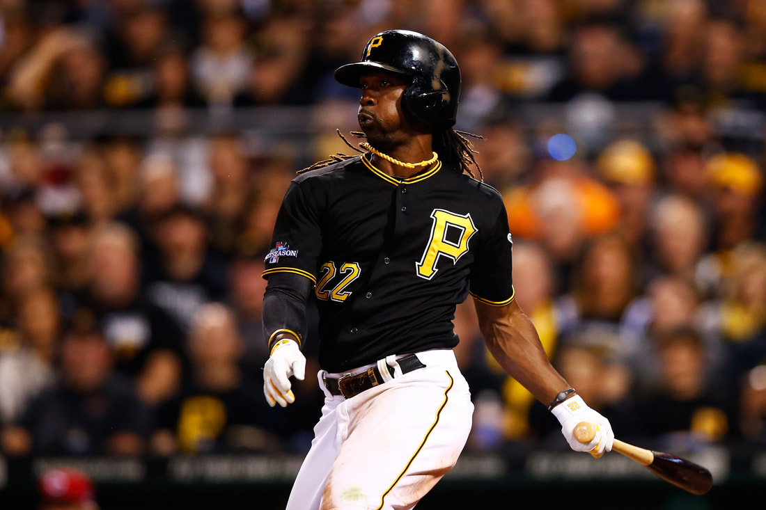
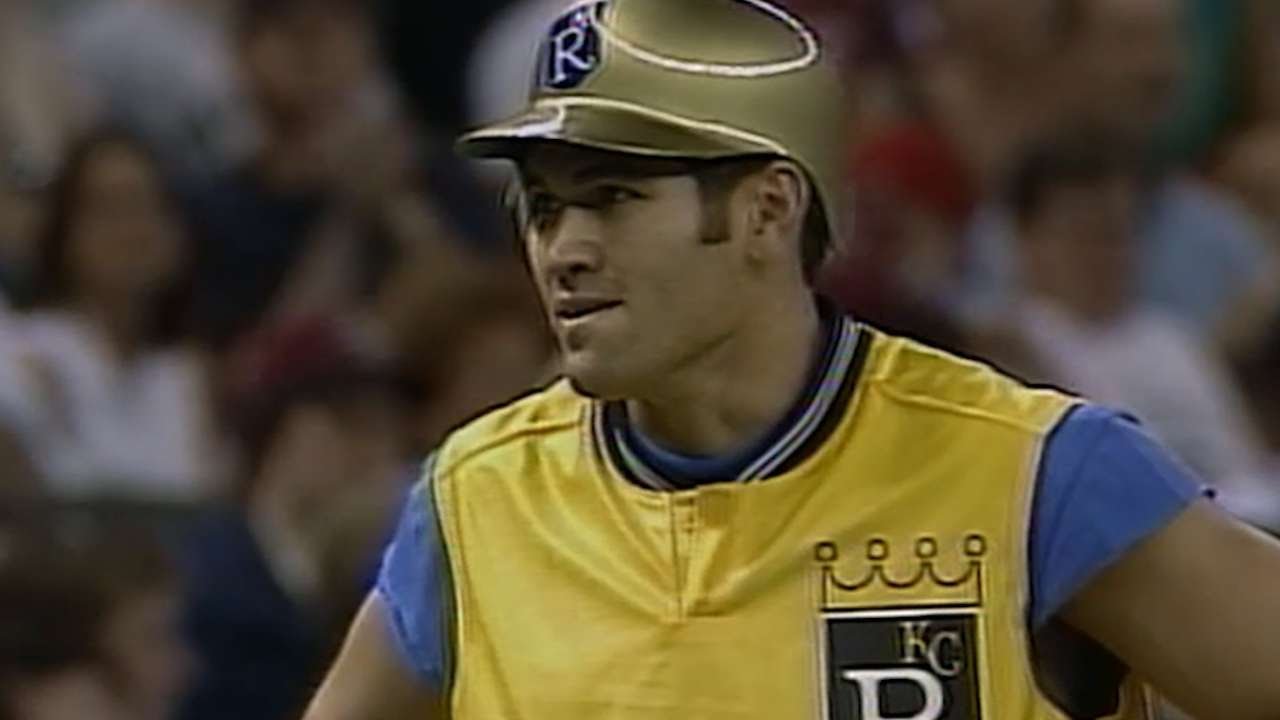
#1) MINNESOTA VIKINGS 1970'S THROWBACK JERSEY
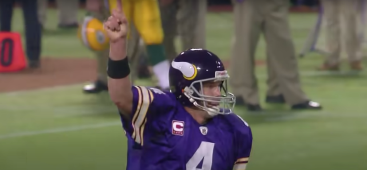
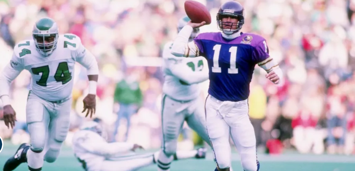
Often referred to as the Brett Favre jersey rather than a 70's throwback because of the masterful work he pulled off while the Vikings were using these jerseys as throwbacks. This is my favourite version of the jersey my team has ever rocked, the classic deep purple helmet, the deep purple jersey with simple yellow and white stripes on the sleeves, simple pants, everything screams classic when they wore it. And when guys like Fran Tarkenton were out there tearing it up in these jerseys, making Super Bowls (and failing at it), those were other great Viking times. This is one of my favourite NFL jerseys and not just my teams.
#2) CERTAIN COLOUR RUSH JERSEYS
The NFL first introduced the idea of "colour rush" in a New York Jets vs Buffalo Bills game, the biggest issue was the Jets were glad in all green from head to toe and the Bills were clad in red from head to toe and this made it damn near impossible for colourblind fans to watch the game; it essentially made every player look like they were on the same team. Not a great start to the colour rush idea. That didn't stop the NFL, they went on and every team received a colour rush jersey. To me there are certain ones that I could've put on my list of ones I like but didn't and then there are ones I'm definitely just not into. The ones I like aren't in a particular like to dislike via the scroll bar for pictures, it's just what teams I like them for. That being: Minnesota Vikings, Pittsburgh Steelers, New Orleans Saints, Los Angeles Chargers, Cincinnati Bengals, Baltimore Ravens, Las Vegas Raiders, Arizona Cardinals, Denver Broncos, Carolina Panthers, the old Atlanta Falcons, and the Houston Texans.
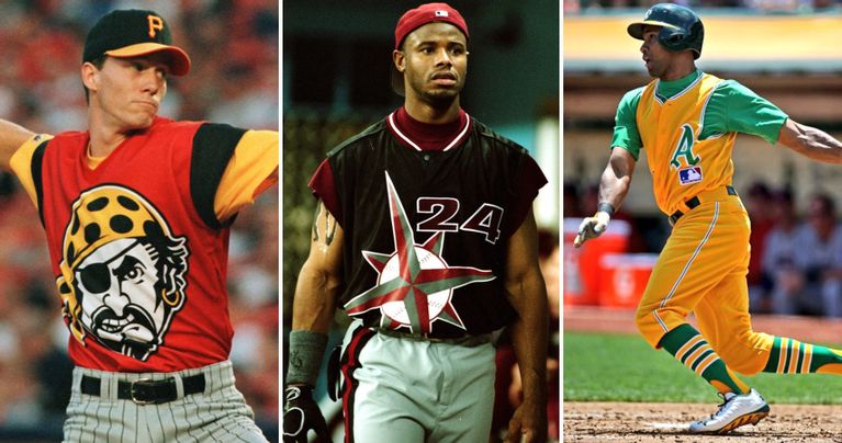
#3) DETROIT LIONS BLACK JERSEY
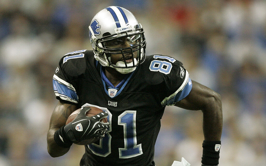
I think of classic blue when I think Detroit Lions, whether it was the more simple blue and silver of the Barry Sanders era or the slightly more complicated jerseys yet still blue, silver, and white of the Calvin Johnson & Matt Stafford era; I tend to think blue jerseys for Lions home games. However, the Lions also had an alternate home jersey that was a sleek black jersey that had blue numbers with silver and white outlines, the jersey also had blue armbands with silver and white stripes as well. Top all that off to even though the Lions were using a "tougher looking", more detailed lion on their helmet at this point, that they went back to more of a classic lion; that made this jersey all the better. Detroit doesn't use this anymore and instead and their plain blue ones, plain white ones, and opts for this hideous grey one as an alternate home jersey. I say rather than the hideous grey, bring back these stylish black ones, it's one of the franchise's best ever looks.
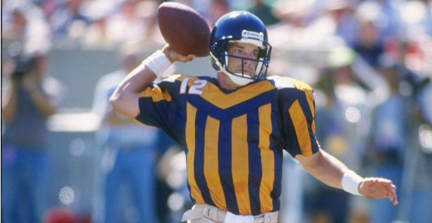
#4) HOUSTON OILERS - 1975 to 1996

Before moving to Tennessee and becoming first the Tennessee Oilers and then Titans, the Oilers were in Houston, and from 1975 until 1996 they rocked these cool jerseys. Technically they did in 97 and 98 as well under the Tennessee Oilers name while deciding on their own unique franchise name, but I only want to count Houston. A home uniform of powder blue uniform with white numbers hard outlined in red; with the exact opposite being the away jersey. A nice sleek white helmet that has a blue oil spout outlined in hard red, with a red cage, and blue and red stripes on it, it's just a great design to a helmet/jersey. I can't remember how many times the Titans have used them since becoming the Titans but they should definitely bring them out again
#5) GREEN BAY PACKERS - CURRENT
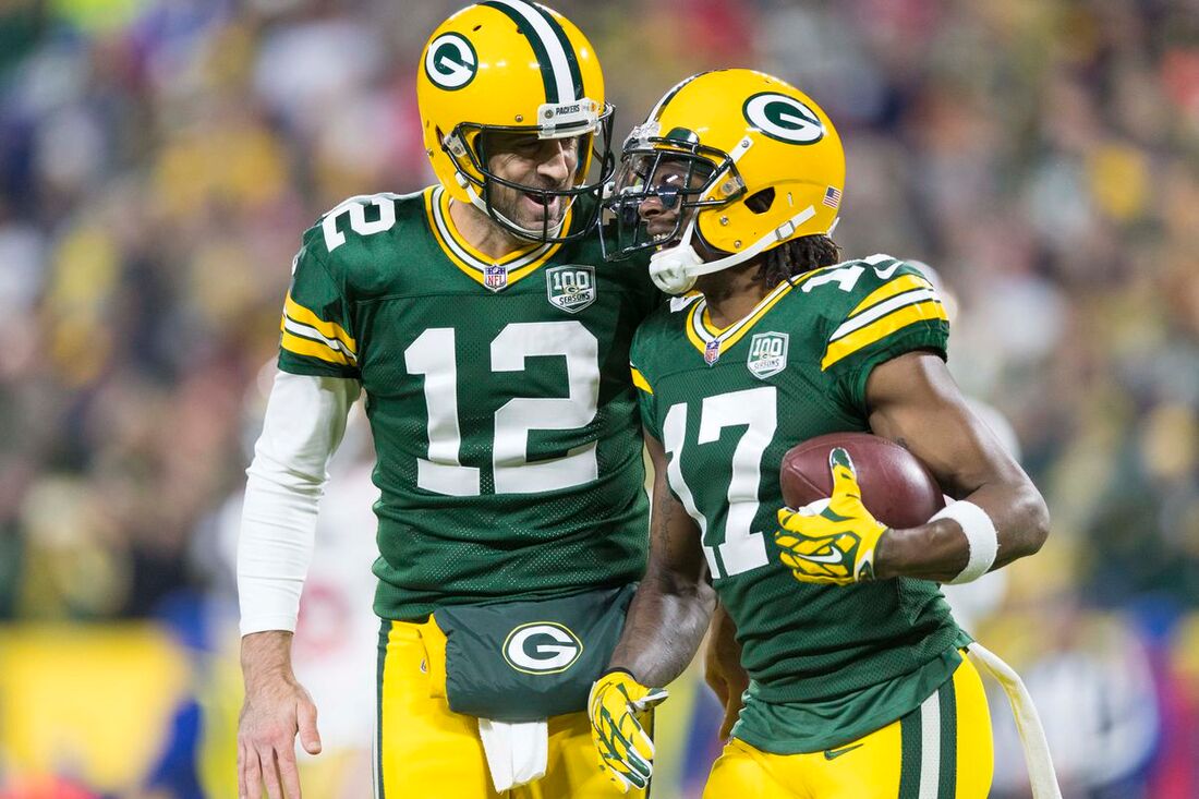
Coming from a Vikings fan this is going to sound like sacrilege but the Green Bay Packers have solid jerseys, they have since Super Bowl 1, maybe pre-Super Bowl era there was some garbage ones (which I'll get to). They're just a solid jersey, there's no doubt whether it's the sleek dark forest green with simple yellow and white stripes, those standout yellow pants with green and white stripes with the helmet to match. Or the white version of this with the green numbers and green and yellow stripes. It's a jersey that is so good it's stood the test of time, there's a reason there's no plans to change the logo or jerseys for the Packers anytime soon.
#6) CINCINNATI BENGALS - 2004 to 2020
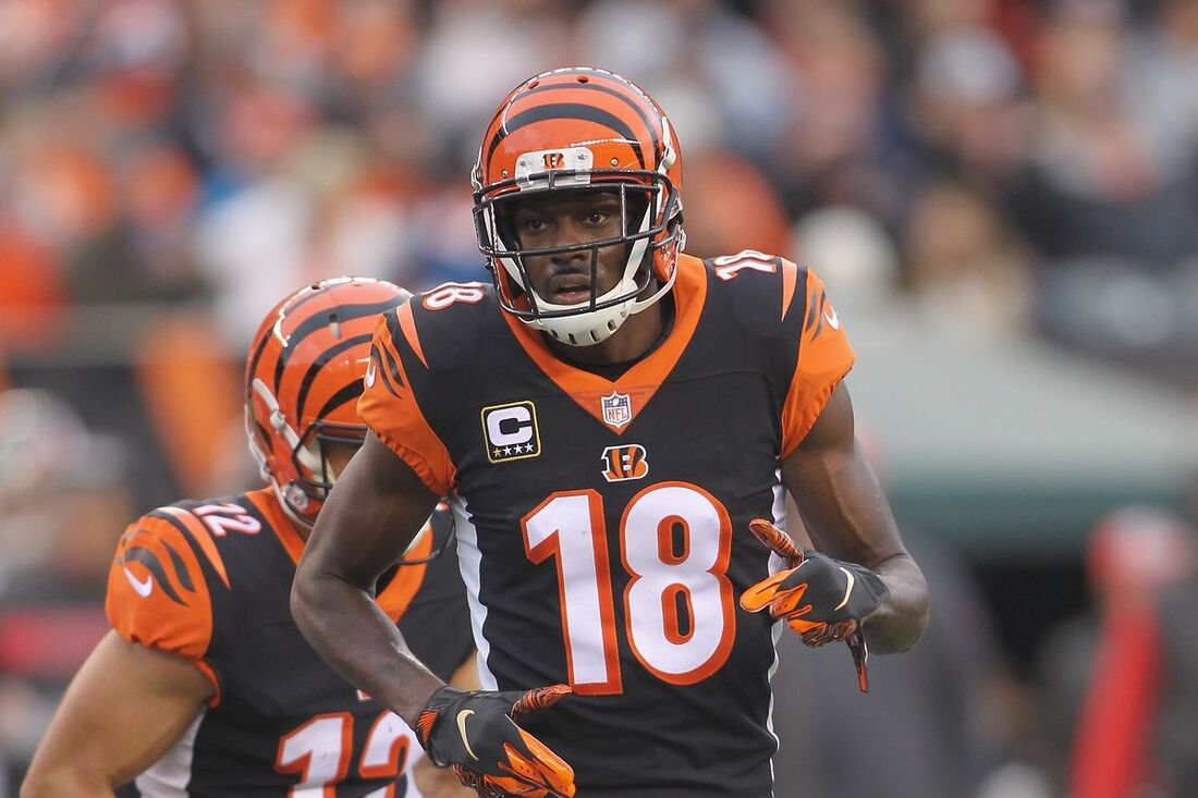
While I love the new look Bengals jerseys a lot, I have to pick the jerseys that preceded them for setting up the concept in the first place. While they're a terrible team, the Bengals have had great uniforms for at least the last 20 years. Many people might say the jerseys they have now or had for a few years beforehand are/were better, I think that as far as the "dreaded side stripe look" that people bitched about, one of the few teams to make it stand out and look proper were the Bengals. For the home, a black jersey with solid white stripes, nice tiger stripes on the shoulders and the white pants, a good looking white number with an orange outline, and those always amazing Bengals helmets. For the away, very similar except black numbers and the tiger stripes cover the whole shoulder. Then there's even the orange alternate which I didn't mind. Then they had the colour rush, which everyone loved so much that they revamped the uniform and turned it into the default jersey of now. The Bengals still have great uniforms, there's only ever been one exception.
#7) JACKSONVILLE JAGUARS - 2013 to 2019
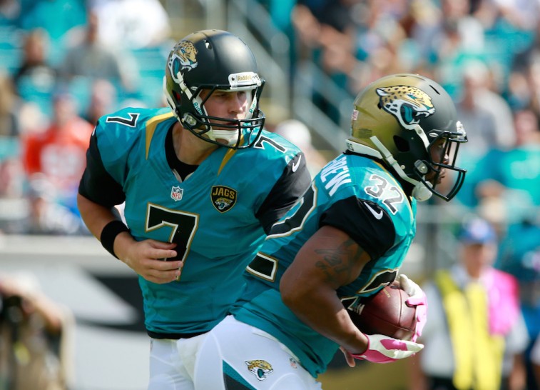
After getting rid of their classic logo, the one they had since beginning of the franchise, at first I thought it was a mistake but immediately the new Jaguar grew on me. Especially the two tone gold and black helmet, I don't care what people say that thing was badass and the fact that they kept the same logo but went to a straight black helmet is lame. I like all 3 versions of the jersey they used during this time, the teal with black armbands and black numbers with gold trim, was my favourite but I liked the home and away jersey a lot as well. I'd say the only thing I didn't enjoy in the entire generation of this style of Jaguars stuff is the "gold jersey" they wore for the first colour rush season. Now the Jags ruined it because they've basically taken these neat uniforms and numbed them down, they got rid of all the flash and basically turned them into what looks like practice jerseys. These were stylin' and I hope Shad Khan realizes that and decides to go back from the garbage he's currently making his players wear.
#8) SEATTLE SEAHAWKS - 1983 to 2001
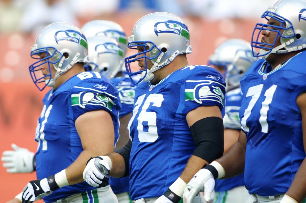
Before 1983 the armband was just green with a tame bird, after 2001 they went to the mad looking bird and dark navy blue. This is the years of the Seattle Seahawks where the jersey was perfect. I love both the home and away versions of this jersey. It has the Seahawk done in the West Coast aboriginal art style, which it technically still is but much less so, on both the helmet and the sleeve, somewhere between the mean bird and the tame bird. A nice blue, silver, and green pallet of colour. The entire jersey just seemed to click, it was a great jersey, not that the Seahawks look bad now but not nearly as great as the jerseys of this time. In fact, Russell Wilson is lobbying ownership to bring back these blue versions of the jersey as an alternate to wear at home games; I hope Russ gets his way because it'd be nice to see those on the field again.
#9) DALLAS COWBOYS - "AWAY" JERSEY
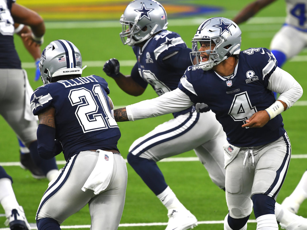
I hate to give the Dallas Cowboys credit for anything, not that I want to discredit anything they've done or the players they've had that I liked, it's just Jerry Jones rubs me and most football fans the wrong way. So giving him credit for anything is tough, that said I have to give the Cowboys credit for their "away" uniforms. I put away in brackets because even though it actually is their away jersey, it's dark colours and not white, their home jersey is white, making them the only team in the NFL to do that and making it a pain for home teams because they need to wear their away jerseys when Dallas comes to town. That being said, that's the bad stuff. I just think it's a well put together uniform, a nice dark navy blue, the star on the sleeve with a grey stripe behind it, the numbers all white with a white outline, and top it off with that classic helmet and silver pants. It's a great uniform.
#10) MIAMI DOLPHINS - 1966 to 2012
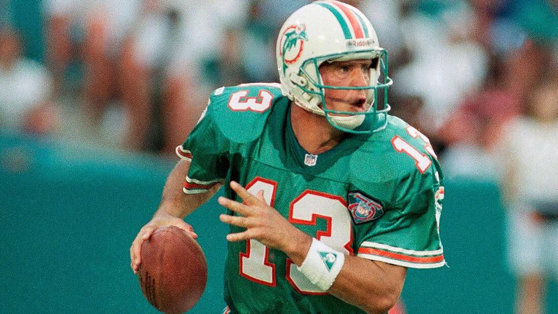
The classic Miami Dolphins look, while I don't mind the Dolphin logo they've been using since 2013 it's the jerseys themselves I've never been keen on. Especially coming off of these, both home and away, the Miami Dolphins had simple and clean jerseys whether a nice dark turquoise with orange & white stripes and numbers or a nice white jersey with dark turquoise & orange stripes and numbers. It was a great look and they were just so cool, then let's look at the best part of those jerseys, the helmet to match them. From 1966 to 2012 they were using different dolphins but the same idea of a dolphin wearing a helmet with a sun in the background, the older ones looked more janky with the best iteration being the tough looking dolphin in helmet they used up until the logo/jersey switch in 2013. It's such a great jersey that they still use it as an alternate and both players and coaches have tried to get the original uniform back into rotation more or just revert back entirely.
MY UGLIEST 10 - NO SPECIFIC ORDER
#1) PITTSBURGH STEELERS - BUMBLEBEE JERSEY
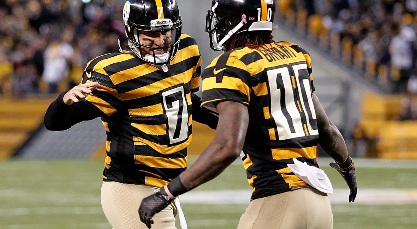
I said there's no order to this and there won't be, from this point onwards, because without a doubt the ugliest NFL jersey I have ever seen worn during the Super Bowl era (so like the 60's until now) is this. Why the Pittsburgh Steelers thought this callback to their history was a good idea I'll never know. The annoying bumblebee stripes is bad enough but top that off with the numbers not even blending in and being a part of the jersey, no they are on white rectangles that literally look like they were slapped on each uniform before the game. Let's finish it with a pair of beige pants, we've got ourselves a winner folks. By far, the worst jersey in the NFL.
#2) PHILADELPHIA EAGLES - YELLOW & POWDER BLUE
Even though the first time (and maybe only I can't recall) that the Eagles wore these throwback jerseys they went out and smoked the competition, these hideous jerseys had nothing to do with it. It was more the fact that a combo of: Donovan McNabb, Terrell Owens, Russell Westbrook were a beastly team. The Eagles jerseys are nice, their Kelly green jerseys are nice, but these things with the yellow and powder blue are awful. It's two colours that just don't seem to go together, like the Eagles shouldn't wear yellow at all and then top it off with a weird powder blue........it's just awful. I can see why some people might find it neat but I think it's one of the worst jerseys in the NFL.
#3) GREEN BAY PACKERS - CIRCLE BEHIND NUMBER JERSEY
The Packers have two really rough looking "vintage" uniforms, I'm not going to include both of them because this one is worse than the other. Let's take a look at some of the really rough things from top to bottom. First off, a pure brown helmet, which is absolutely disgusting and I can't tell if this is a throwback to how old helmets were just brown pieces of leather or what but this is just awful. Then the jersey, it's navy blue with a giant yellow circle on it that the numbers are in; a giant yellow circle on it where there the numbers are like that's the worst thing about this jersey. To me, how numbers look on a uniform is incredibly important and this is just vomit worthy. And then let's cap it off with the beige pants, those awful beige pants, I just hope the Packers don't use these ever again.
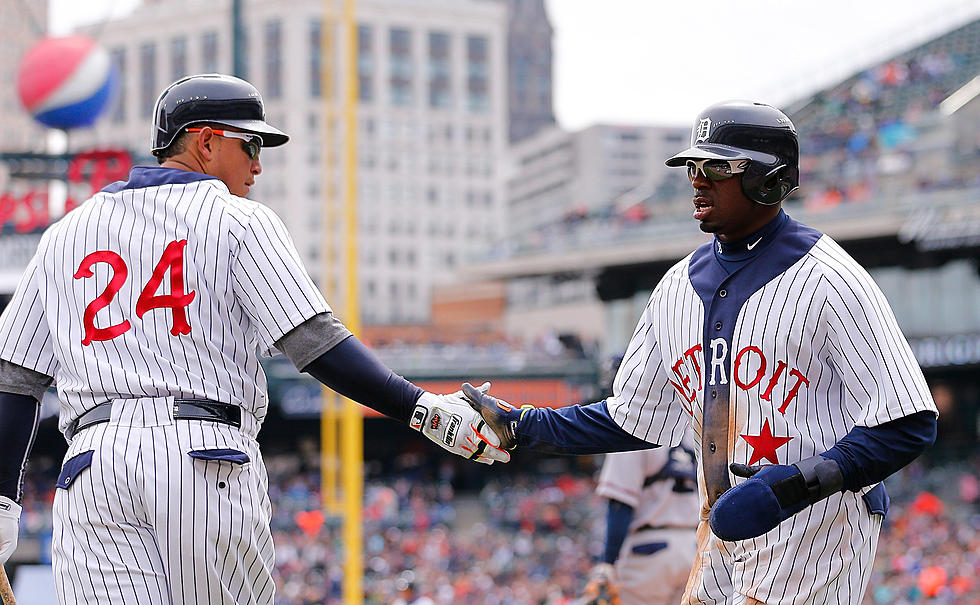
#4) CLEVELAND BROWNS - 2015-2019 UNIFORMS
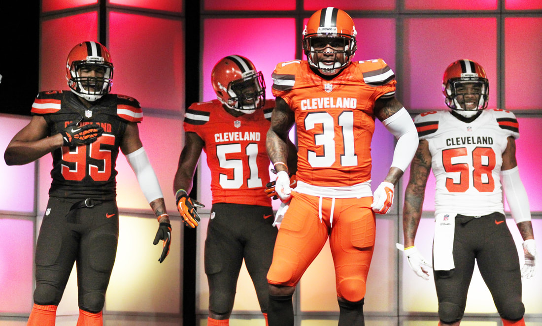
Ya, my buddy Alex is going to give me shit for this but I think the combos that Cleveland used for the 4 years before the pandemic were absolutely terrible. Coming off of a nice slick brown uniform with side stripes or white uniform with side stripes, basically a solid and well put together uniform along the same linens as the Packers, they decided "alright fuck it lads, time for a rebrand". I get that college uniforms can be cool and an interesting idea to "copy", if you look at the Seattle Seahawks it could have potential, but the Cleveland Browns kind of missed that. First off, there were WAYYYYYYYY too many colour combinations and that was a problem; just having a home, away, and maybe an alternate is enough. They put Cleveland above the numbers, being the only team to do that, I thought it was unnecessary and looked gaudy. Speaking of unnecessarily putting words places, lets not only put Cleveland on the uniforms like spazzes but in case people didn't know our team name lets plaster Browns down the side of each leg. These are probably my least favourite modern uniform honestly.
#5) CHICAGO BEARS - NFL 75TH ANNIVERSARY THROWBACK
Again, another hideous throwback jersey from a classic team. I get it the Bears like many other teams have history well before the Super Bowl era but listen just because they do, doesn't mean that the old jerseys they used should ever see the light of day again. This Chicago Bears jersey, is an example of that, luckily it still has the classic navy helmet (minus the C logo) but the uniform looks like it might as well be a shittily put together referee outfit. Gold and blue with the number on the top right shoulder, I am a stickler for number placement so this one truly bugs me more then that shit Packers uniform. It's another terrible uniform, plain and simple, I can't imagine the Bears ever using it again.
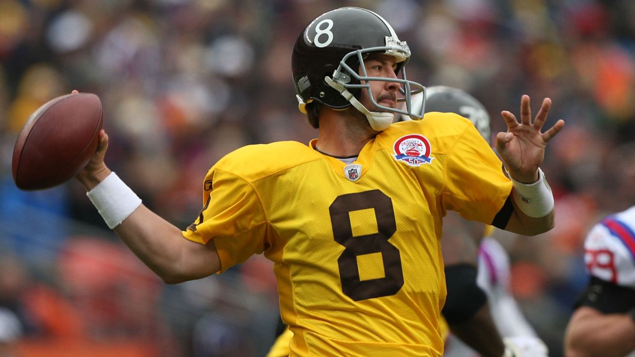
#6) CINCINNATI BENGALS - 1970'S THROWBACK
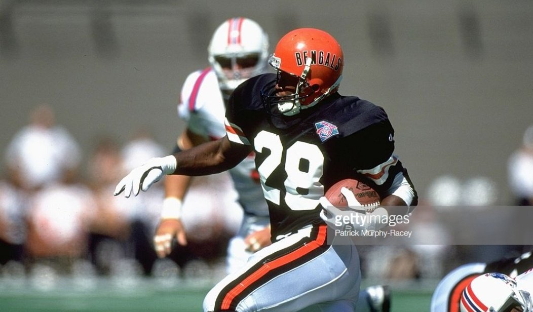
I get that both teams are from Ohio, but there's no reason they need to look exactly the same with the only difference is that one team's helmet says "Bengals" on the side and the other doesn't. Considering over the years the Bengals have had some of the coolest jerseys despite being in a sad state many seasons, this is a sad example of a jersey that was something that BARELY functioned in the 70's. It made a brief comeback during the 75th Anniversary of the NFL (like what seems was many other abomination jerseys did) and there was rumblings that Cincy was going to do it again but thankfully they didn't. Hopefully, with these slick new Bengals jerseys, hopefully the only new thing we see is the white tiger helmet and that's it.
#7) ATLANTA FALCONS - CURRENT UNIFORMS
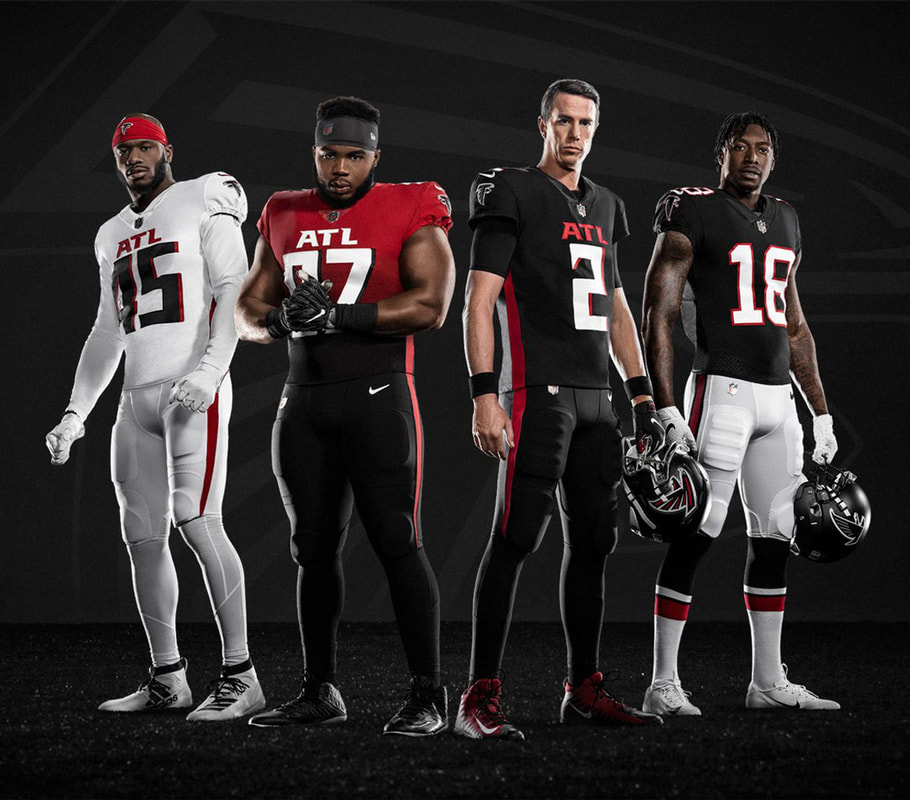
Very similar to the Cleveland Browns, the Atlanta Falcons were a team that wasn't needed at all. In my mind the Atlanta Falcons have always had great jerseys, the classic ones from the 80's and 90's that guys like Deion Sanders wore all the way until the change during the Micheal Vick era, they were great. While they kept the cool Falcon and the helmet the same, they too decided to put ATL above their jerseys as if people didn't know they were from Atlanta. Not all, jerseys meant to look like NCAA jerseys work because not all NCAA jerseys look good. Honestly, if they got rid of the ATL on all three jerseys and gave the away jersey black pants, I don't think I'd mind it; I especially know that getting rid of the ATL would make me like that fade jersey. There's just minor nitpicks I have when it comes to jerseys, especially when you take a jersey that was great like the Falcons had and make it a college inspired one that backfires.
#8) MINNESOTA VIKINGS - 1989'S LIGHT PURPLE ON DARK PURPLE
The Minnesota Vikings, my team, have always had great jerseys (despite what people say about the ones from the mid-2000's I thought they were fine). However, there was one jersey we had that I can say has to end up on this list of ugly jerseys. That was in 1989 we had taken our usual jersey but for some reason it was two tones of purple. It had the typical dark purple you expect of the Vikings behind the numbers and most of the jersey, but the entire shoulders and leaking into part of the sleeve was this much lighter purple. It definitely detracted away from the Vikings look, especially since they were still using the normal classic away jerseys, this abomination would be rectified quickly but it was hideous while we had it. Of course it was when we got Herschel Walker, so we were cursed with two bad things.
#9) TAMPA BAY BUCCANEERS - 2014 to 2019
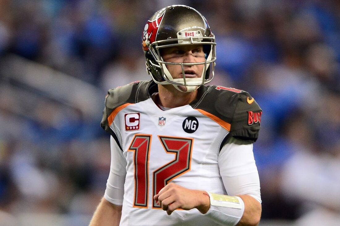
All everyone had to say was what the fuck happened when these were released. The Tampa Bay Buccaneers had been rolling with a sleek red, pewter, and white (which they still did with this jersey but that's not the point). They'd been rocking that uniform since the early 2000's, most particularly during their Super Bowl Championship year, I was like "ahh they'll never change". Then they did and while I think bringing back a tinge of that good ol' creamsicle orange was a great idea, that was the only good thing. They enlarged the Bucs logo on the helmet so it took up 80% of each side for starters. Then lets look at the jersey, regardless of home or away you had these terrible pewter shoulder pads with orange trim underneath, then the worst part about it, the numbers. If the numbers were normal MAYBE and this is a big MAYBE they may have been okay, but they were these gaudy looking futuristic numbers whether they were red on the away jersey or white on the home jersey. It was just awful, then there was the even worse gag fest that was their colour rush, a pure red uniform with pewter numbers outlined in white. I'm glad they switched back to essentially the same jersey they used during the Super Bowl era, surprisingly they did that and won another Super Bowl; they probably were like we can't have Tom Brady wearing these god awful jerseys, Jameis was fine but not Brady, so they brought back the old ones. Good choice. Side note is while many might consider the classic creamsicle jersey one of the "bad ones" I don't so I don't lump it in with the other Bucs bad jerseys.
#10) DENVER BRONCOS - AFL THROWBACK JERSEY
Honestly, what the heck is this, like for a team that's been all about the horsey showing up looking like the Pittsburgh Steelers is a rough look. A garbage black helmet with a number and white stripe on it, a terrible yellow uniform with brown numbers, brown pants with a yellow stripe and striped socks of some fashion; it was just atrocious to look at. It basically looked like either a Steelers or Washington practice jersey, it was that generic and that bad. Let's just chalk that up to another bad throwback along with several others on this list.
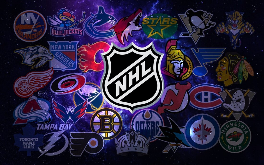
THE NHL
MY BEST 10 - NO SPECIFIC ORDER
#1 - THE ORIGINAL SIX NHL JERSEYS
This is only going to count as one jersey and not 6 because to me I consider the Original Six NHL teams have perfect jerseys, even though they've made slight modifications over the century plus each team has been around now. The Montreal Canadiens, Chicago Blackhawks, Toronto Maple Leafs, New York Rangers, Detroit Red Wings, and Boston Bruins all have classic jerseys that will be virtually impeccable until the end of time and it's why these teams have rarely changed the jersey's look and when they have RARELY does anything look good.
#2) WASHINGTON CAPITALS - EAGLE JERSEY
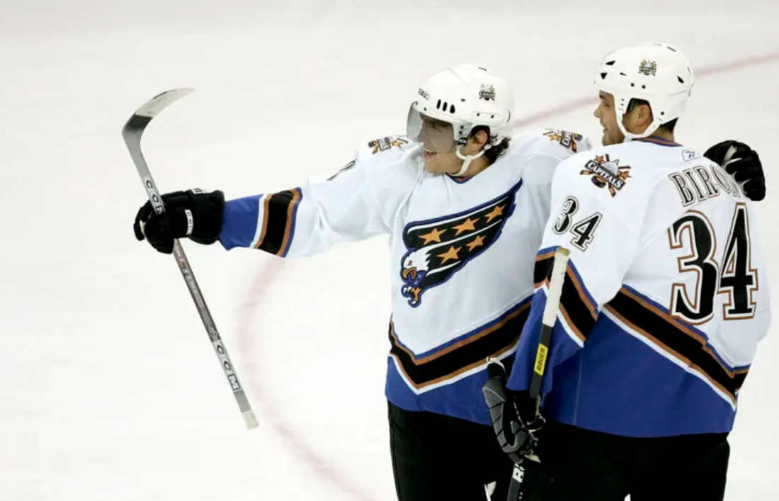
The best jersey the Washington Capitals have ever had in the history of the franchise has been the eagle jersey. They dropped using the words Capitals on their jersey and the red, white, and blue to go for a black, turquoise, white, and gold look centred around the most important thing the eagle. To me, the bottom stripes where so unique to the time and even to now, the checkmark design to it was interesting. The jersey also had interesting number designs. The diving eagle though with the stars is the centrepiece to this great jersey and is the reason I love it so much; it was such a badass logo and the colours melded so well with the logo, it was so cool. Which is why I was super stoked that the Capitals brought it back as their Reverse Retro and will now be using it as an alternate jersey but in their current red, white, and blue colours which is SUPER AWESOME. It's what I hope for every great team logo.
#3) CALGARY FLAMES - ALTERNATE JERSEY 2003-06 - THE FLAME HORSE
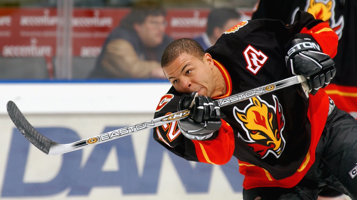
The greatest jersey in the history of the Calgary Flames, I don't care what anyone else says, like a lot of people say this belongs on the ugliest list or since it's not the classic it's not the best. This is not true, what's cooler than blending the flames of Calgary's team name with the biggest thing that occurs in their stadium besides that. The Saddledome, the home of the Calgary Stampede. Let's put awesome flames coming out of the nose of an incredibly badass horse. The fact it's a killer black jersey with red, yellow, and white striping is just an awesome jersey. The Flames gave up on it and started using a couple other alternates, then suddenly I was pumped that when they revealed their Reverse Retro jerseys and decided to do the horse again. It's awesome Calgary decided to bring it back as their reverse.
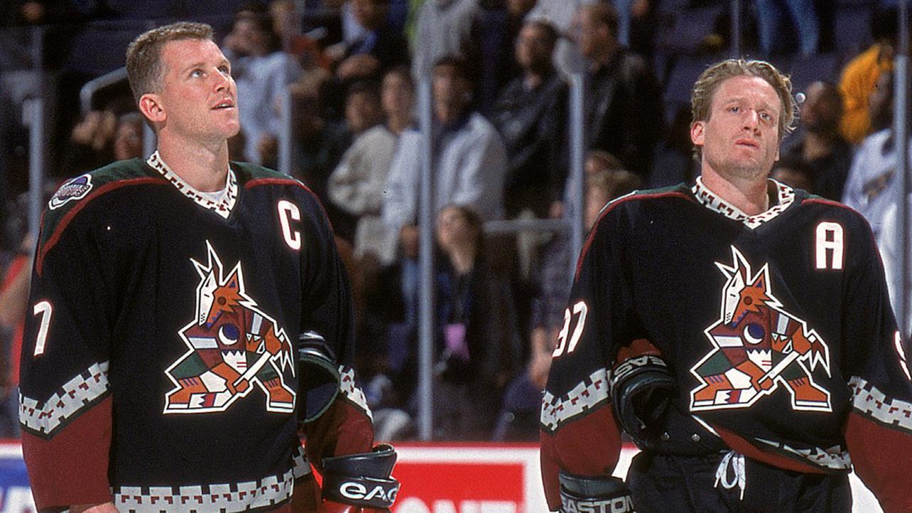
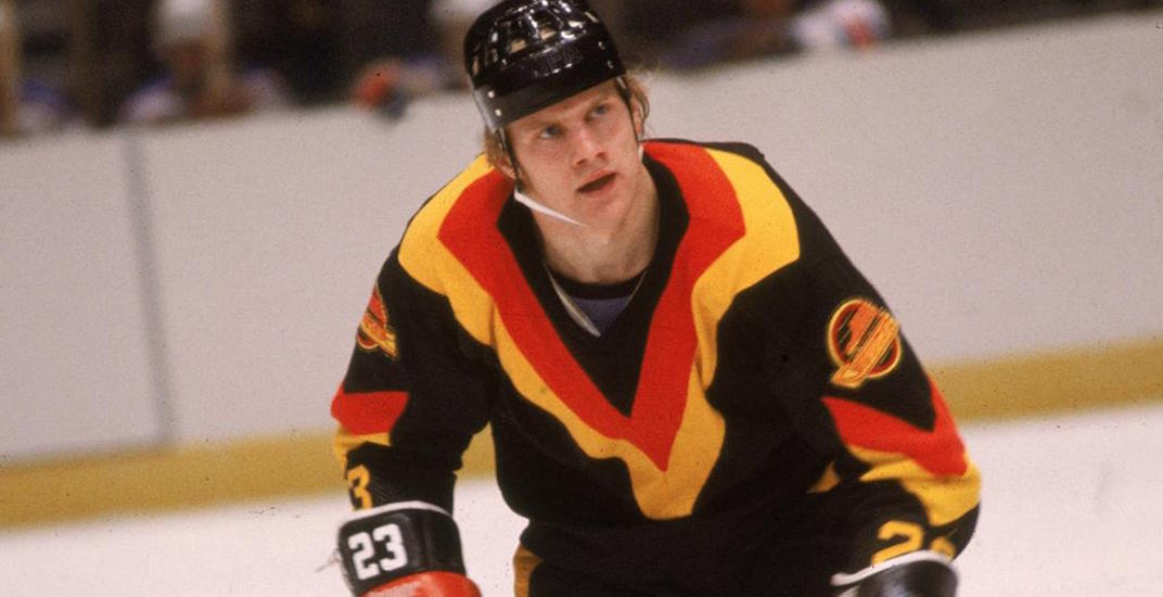
#4) PHOENIX COYOTES - INAUGURAL JERSEY
The jersey they started with after their move from Winnipeg to Phoenix, I absolutely adore it, incorporating the local Navajo aboriginal designs into the jersey. The cool coyote with it's design, the colours, the lines around the neck and closer to the arms, all of them just great things. It was such an amazing jersey that I was so sad they got rid of it, the original lasted from 1996 all the way to 2003; not that their replacement logo or jerseys were bad, I just thought a tad plain and not nearly as good as the old Coyotes jerseys. From 2003-2018 it was the new logo with variations of the jerseys stripes but in 2018 through 2021 the Coyotes realized how great the old jersey was and started using it as their alternate 3rd jersey. In the 2021 season and going forward, the past has come full circle, and the jerseys are now these again with the burgundy coyote as their alternate. It's exciting times for the Coyotes, though if their move from Arizona does happen I suppose that will change a lot.
#5) COLORADO AVALANCHE
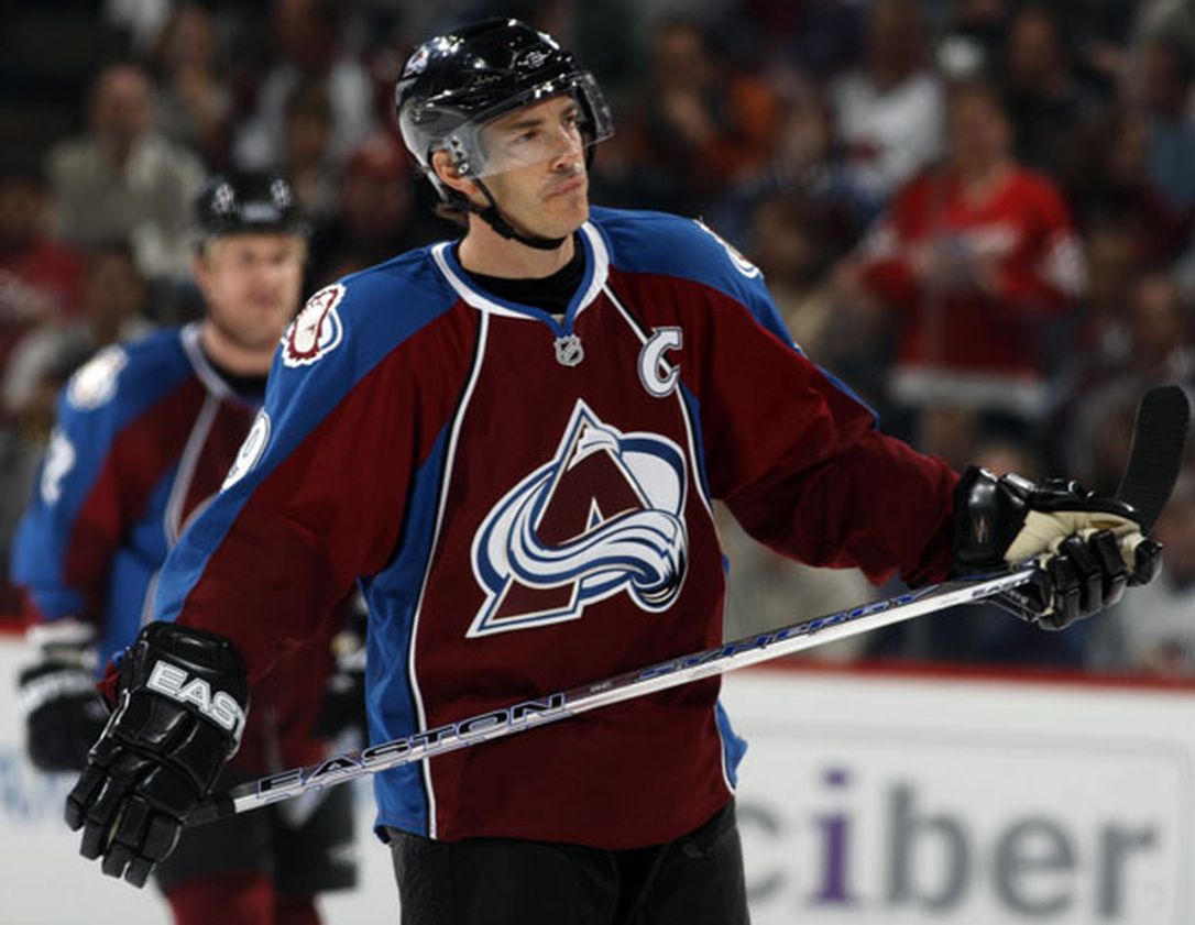
When the Nordiques moved from Quebec City to Denver, they became the Colorado Avalanche and along with that, they got lucky and got a great uniform as well. The Avalanche took on the burgundy, blue, white, and black colour palette and that in itself was awesome but that's not where it ended. The jersey was laid out in a unique way with the "striped" part of the jersey covering the side of the jersey and side of the arms. There were either white or black lines going from waste to should and the Avalanche used a unique style of numbering not seen before then. They had a cool side patch logo in a yeti's foot and their main logo was a giant A made to look like a mountain where there was a giant avalanche swooping across it with a hockey puck. I got to see my favourite goaltender (maybe even player) ever Patrick Roy head there and don the jersey and with Joe Sakic and Peter Forsberg carry them to a Stanley Cup. Great uniform that has gone relatively unchanged to this day, in fact the new reverse retro jersey is using the Avalanche colours but making it a Quebec Nordiques jersey.
#6) VANCOUVER CANUCKS - THE ORIGINAL ORCA
When the Canucks got rid of their "original" skate logo I was like oh no what's going to take it's place, but they worked with a local aboriginal group and created an orca logo for the Canucks to use that honored West Coast aboriginal tribes using their art style. It's honestly my personal favourite style of indigenous art work, most people think of the thick black lined northern art common to my region but for me when I hear aboriginal art my mind darts to the west coast art. I find the style to be so unique between the creative paintings, totem poll carvings, etc. So they had this beautifully designed orca and then had a colour pallet of black, burgundy, white, and blue (similar to Colorado but different). I just found this to be one of my favourite NHL logos at the time (possibly still is) and just the colours everything seemed to mesh so well. Since it all meshed so well that's what pissed me off about them going to blue, green, and white as their colours I felt it took too much away from the logo and from the jersey. I'm glad that they still do have the logo though even though with it either being just white or just blue depending on the jersey it does take away from it. Great jersey.
#7) MINNESOTA WILD - REVERSE RETRO JERSEY
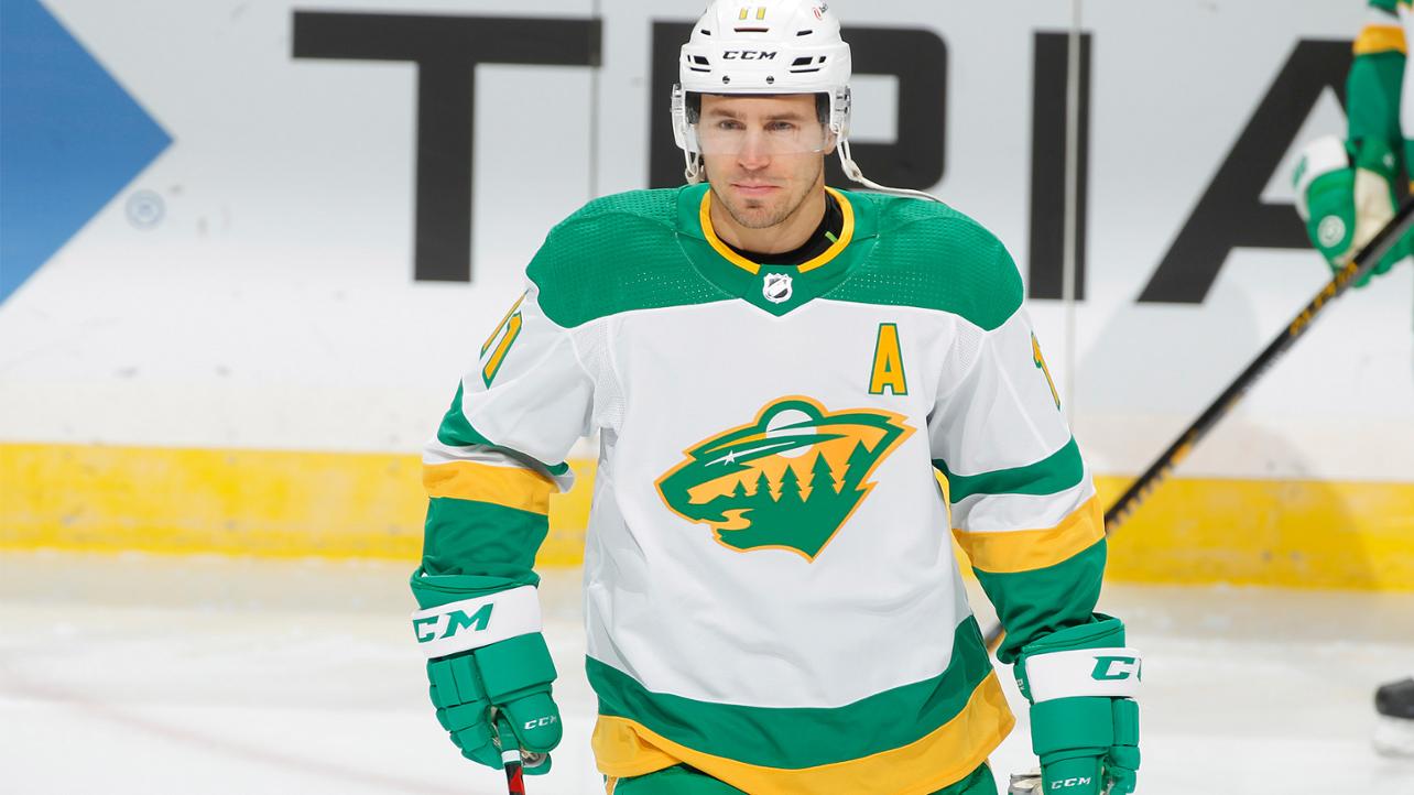
The Minnesota Wild were a team that I think were really necessary when they came into the league, because hockey is so important to Minnesota and they hadn't had a team since the North Stars left for Dallas all those years ago. I love the Minnesota Wild's logo of a bear with a forest in it, a fully moon, and a shooting star for the eye. I enjoy the jerseys they had that make that prominent, so they have some jerseys that suck in my mind, but this to me is the PINNACLE of the Minnesota Wild jersey. Why is it my favourite jersey of theirs and what I consider to be the pinnacle of their jerseys ?? That's simple, it's a simple and clean version of their away and home jersey, which highlights the bear logo as the focal point but the most important part; is that it's done in Minnesota North Stars colours. It's a combo of the old and new so when they released these as the reverse retro jersey I was floored with how awesome it was, I hope the Wild use it a lot and honestly even though their forest green, burgundy, beige colour scheme is cool if they went back to the North Stars colours and did this permanently I'd be cool with it.
#8) ANAHEIM MIGHTY DUCKS - INAGURAL JERSEY
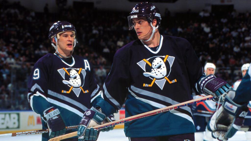
In the 90's there was a movie starring Emilio Esteves about a lawyer busted for a DUI who is forced to coach a hockey team for community service. I'm sure most of us have seen it so I don't need to go over it or the two sequels that it spawned. This was a Disney movie franchise and when a team expanded into the NHL near Disneyland in Anaheim, California the two worked together and thus the Mighty Ducks of Anaheim were born. They weren't always a great team but they had two generational talents in Teemu Selanne and Paul Kariya, however it was their jerseys that stuck out. It was so unique at the time, it was a cartoon style duck that was a goalie mask; a design that Disney would themselves would use in their Mighty Ducks cartoon giving the main duck this mask to wear. With crossed sitcks in the background done on a dark purple (or white) jersey will tuqoise, white, and grey. It was so unique but the most unfortunate part was eventually some stuff happened between the Ducks and Disney, so they had to change the team name to the Anaheim Ducks and the logo had to change because their logo was owned by Disney. It would take years for it to reappear as an alternate jersey in Anaheim when they used it with their new colours of black, orange, gold, and white; finally now with them using it as either the original alternate or just straight out their jersey again, I don't quite recall.
#9) BUFFALO SABRES - THE ANGRY BUFFALO
In the late 90's and early 2000's, the Buffalo Sabres switched from their classic logo of the circle with two crossed swords with a buffalo above it to my favourite version of the team's jersey the angry buffalo. They picked a way better colour scheme in black, white, red, and a touch of silver/grey. The design of the jersey is awesome with triangles coming up the side, the well placed stripes on the arms, the number design they use, but the BEST part of these jerseys and the BEST part about this rebrand was the logo of the buffalo itself. It was an AMAZING logo, a tough looking, angry buffalo, done in white and black with silver lining on the face, outlined in red and white was fantastic; why Buffalo ever decided to rebrand after this was a mistake. The Sabres had a great chance this past year to bring this awesome logo back with new colours as the MAIN logo and not just a patch for their Reverse Retro jersey but they fucked it and just made it a patch. It's the best thing they've had and you think you'd want to be represented by the only logo where you made the Stanley Cup finals for the rest of your organizations existence.
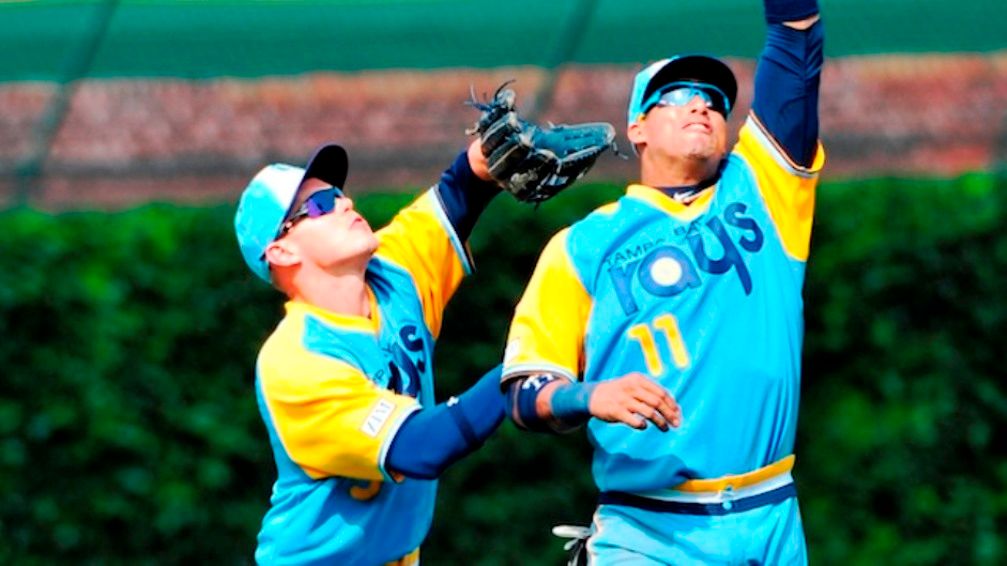
#10) SAN JOSE SHARKS
I've always been a big fan of the San Jose Sharks uniforms and the latest iteration of the jersey is by far my favourite version of it. They use a deeper turquoise for their colours and the offset of that nice deep orange for the contrast, along with the classic white and black are great. What I love most about this in comparison to their old jerseys is the shark is so much meaner and tough looking. The jersey is very clean and sleek, it's a well designed jersey. My favourite version of it is their alternate jersey where the entire shark is visible but I wasn't going to make that the only choice because all of the versioins of San Jose's jersey are nice.
MY UGLIEST 10 - NO SPECIFIC ORDER
#1) LOS ANGELES KINGS - THE KING
During Wayne Gretzky's tenure in Los Angeles, just before the Kings rebranded for the 3rd time, they released one of the ugliest jerseys in the NHL at the time and now possibly ever. If not already called "The King" that is what I will call it. A giant wavy almost gradient grey from the shoulder to the waist, a really dumb looking and ugly king logo, and trying to throwback to old colours both the king and numbers were done in purple and gold. It was an awful third jersey at the time and hasn't aged well, at least the rebrand they did after this with the purple, black, and white looked much better.
#2) MONTREAL CANADIENS - SUPER OLD THROWBACK
All I have to say as a lifelong fan of the team is what the fuck is this garbage ?? I get it that throwbacks are cool, Montreal is one of the oldest teams in the NHL, but I would rather them bust out their old Thistles jersey than this. They have a ton of cool throwbacks or alternates to use, what the heck is this even. The stripes are the worst like I hate most horizontal stripe jerseys like this but what to me is the most damning thing about this jersey is that the logo even though it says CAC in it looks so god damn close to a Toronto Maple Leafs logo that it's insulting as a Canadiens fan. I never, ever want to see Montreal wear this abomination ever again.
#3) VANCOUVER CANUCKS - INAGURAL JERSEY
The shoulder V, is Vancouver's worst jersey and they're also the team who thought it was good to just have a hockey stick as a logo too so that says how bad I think this is. I think it's awful only because of the jersey that came out of this colour scheme, where they used the patch on their shoulder as the logo on the chest and used the red and yellow stripes in a more classic way. Just to me it seems like an incomplete jersey is the problem, like I get the patch is the logo but the jersey doesn't look done. It's awful and when Vancouver wore the jersey as a throwback on their 50th anniversary, it to me looked worse in the modern era than it did back then. Never again Canucks, if you wanna rock red, gold, and black again do the Trever Linden & Pavel Bure early 90's jersey look, that was great.
#4) THE "TEAM NAME" JERSEYS
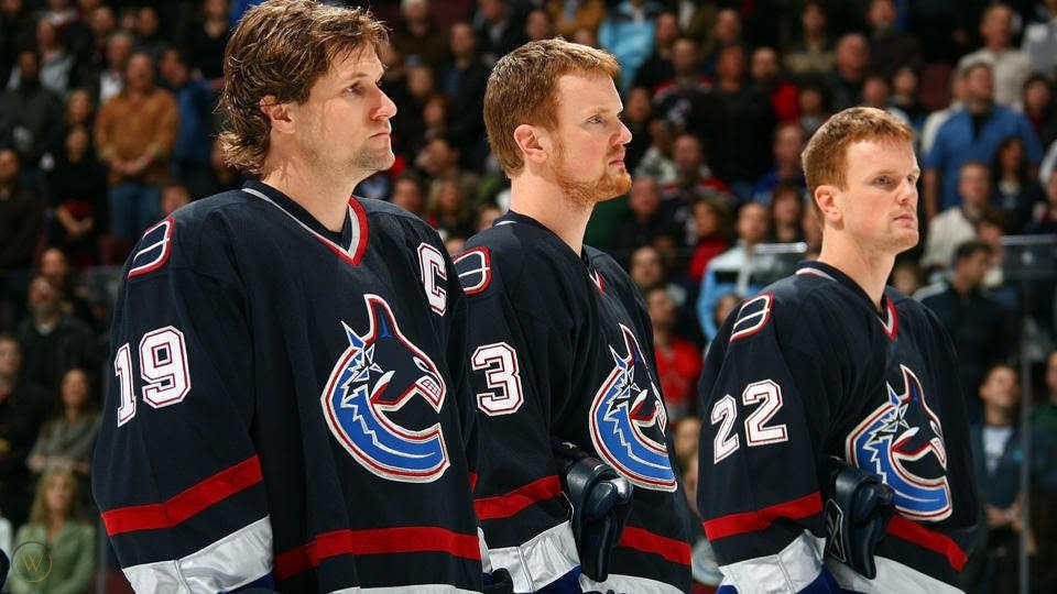
Not all teams, but quite a few of them, back in the late 90's and early 2000's had what I call the "Team Name" jersey and I thought they were all hideous. Teams like the Islanders went from their classic look, to the just as cool fisherman, to using these jerseys that just said "Islanders" for awhile. Dallas got rid of the jersey that incorporated their logo, the ones they one the Stanley Cup in, for jerseys that just said Dallas. Same went for so many other teams, including and shoot me if you want but the Pittsburgh Penguins one of this too is also trash, when they had the penguin with the stick and also the other cool penguin jerseys; absolute waste to get a jersey that just says Pittsburgh. I just absolutely hate the team name on the jersey stuff with the number on the front too, it's just an awful look and I'm glad that all of the jerseys like that are gone with the exception of the New York Rangers but since they've been using it since the beginning of time and since it looks great, they get a pass.
#5) NEW YORK ISLANDERS - THE "BROOKLYN" JERSEY

When the New York Islanders finally decided to move out of the desolate, bleak, garbage arena they'd been playing in on Long Island since the 70's and move into the Barclay's Arena in Brooklyn they decided to add this logo to their arsenal of jerseys. The idea being that it would be a cool alternate jersey to match the other team that shared the arena, the Brooklyn Nets team in the NBA. Unfortunately, it's just not a look that caught on and it was definitely not a very New York Islanders style jersey, but you can't totally fault it because it did end up changing colours to traditional Islanders colours and created a solid new alternate jersey for the team instead. It was a case of a great idea that just didn't pan out properly.
#6) NEW YORK RANGERS - THE FULL LOGO
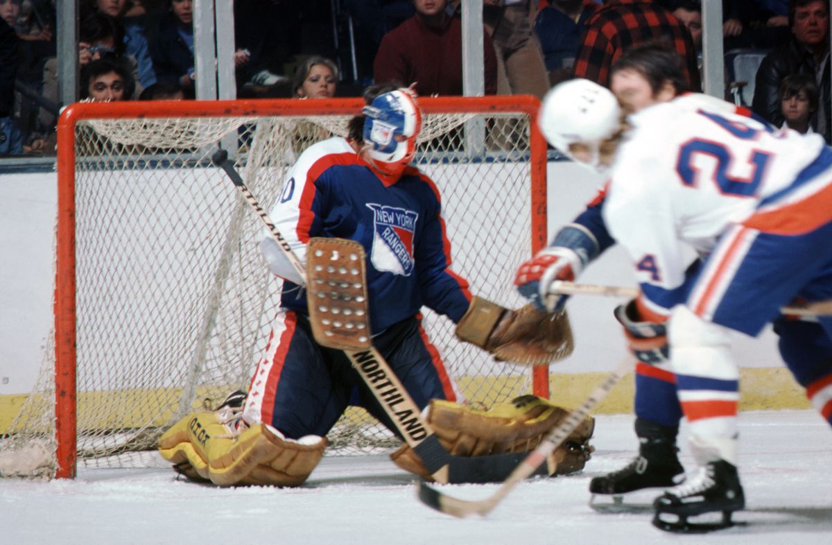
So when I mentioned that the Original Six jerseys were impeccable and very rarely needed changes, sometimes if they did it just didn't work well this was a case of it not working. The New York Rangers should only ever have three jerseys, the home blue that says Rangers in a diagonal line, the away jersey that says New York in a diagonal line, and the Lady Liberty alternate jersey. Using the teams actual logo (which isn't even a nice logo) as the front of the jersey was just AWFUL like it was a dreadful jersey in the 70's and I felt bad when Rangers brought it back and used the dumb thing again for their Winter Classic jersey that one year. I'm glad that the Rangers realized it was trash and don't use it anymore.
#7) TORONTO MAPLE LEAFS - ST. PATS THROWBACK
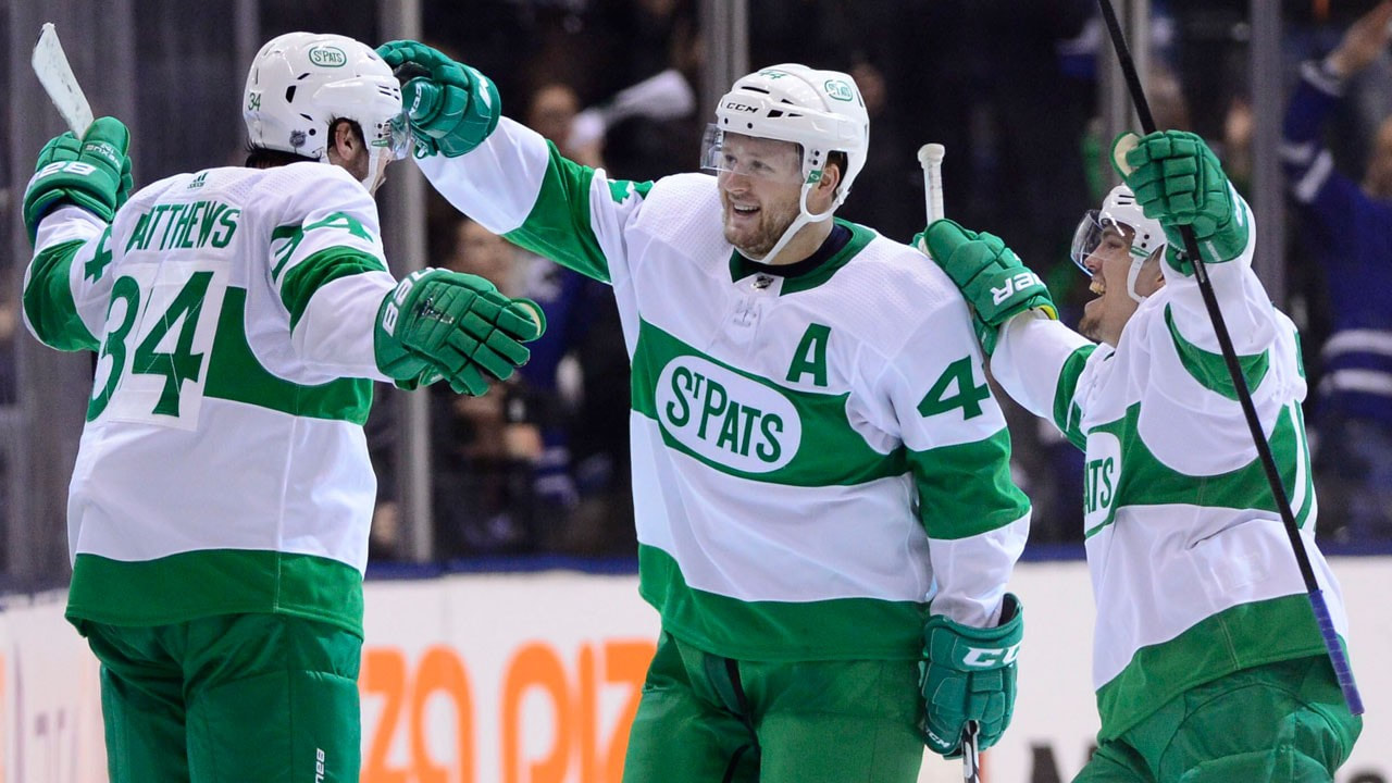
Being a Canadiens fan you might be saying that I'm tossing bias out here by putting a Leafs jersey here. Incorrect because Montreal is in the ugly jersey list too. This is on here because while I understand throwing back to the St. Pats is neat, every version that Toronto has ever used has been fucking dreadful. It's just not worth doing when the Toronto Maple Leafs have a legit nice looking, classic jersey; when your jersey is as crisp as the Leafs making changes is usually a bad idea as with any other Original Six jersey. So ya, well it's a neat idea they just don't need to do it because they have terrible jerseys to use.
#8) PITTSBURGH PENGUINS - POWDER BLUE
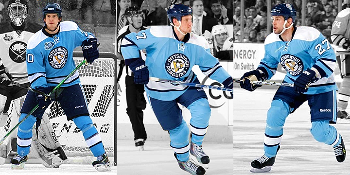
Just why has always been my question about this stuff. Between this jersey above, the one with the dark blue with powder blue stripes, or the powder blue jersey that just says Pittsburgh on it. Just why ?? What about the Pittsburgh Penguins ever has been powder blue for the team, why use it, what the hell I just don't understand. It's AWFUL looking, like just absolutely dreadful. The only three colours you should ever see a Penguins jersey in is in black, white, and yellow/gold. It's that simple.
#9) DALLAS STARS - BLACKOUT JERSEY
When they released the pictures for these I had to check my calendar to see if it was April 1st, or if it wasn't that the Dallas Stars were just going to come out on Twitter and say, "psych". But they didn't. These hideous "blackout" jerseys are exactly what they look like, straight black jerseys that Dallas had and instead of their normal green and white they are using bright neon green. Like, it is by far one of the most dreadful jerseys to see designed in the past several years, I have no idea who in Dallas' front office signed off on this and said, "this.......is brilliant". It isn't guys, it isn't.
#10) ATLANTA THRASHERS - HOME JERSEY
Ahh, just as awful as the team, the Atlanta Thrashers home jersey. Lets start with the awesome powder blue jersey, it's so ugly, then continue on and then we look at the arms, with the left arm being the only striped side and it saying ATLANTA on the side. They only side their secondary logo is patched on is the other arm and everything just seems off. It's a lack of complete symmetry, like even a jersey like the Capitals where they have the checkmark bottom may not look symmetrical but the rest of the jersey is; this jersey is just an all over the place mess. What makes it worse is that the Thrashers had a very clean looking and nice away jersey and alternate jersey, the only problems were this ugly home one and the "team name" one I discussed above.
THE NBA
MY BEST 10 - NO SPECIFIC ORDER
#1) TORONTO RAPTORS - THE RAPTOR ON THE JERSEY
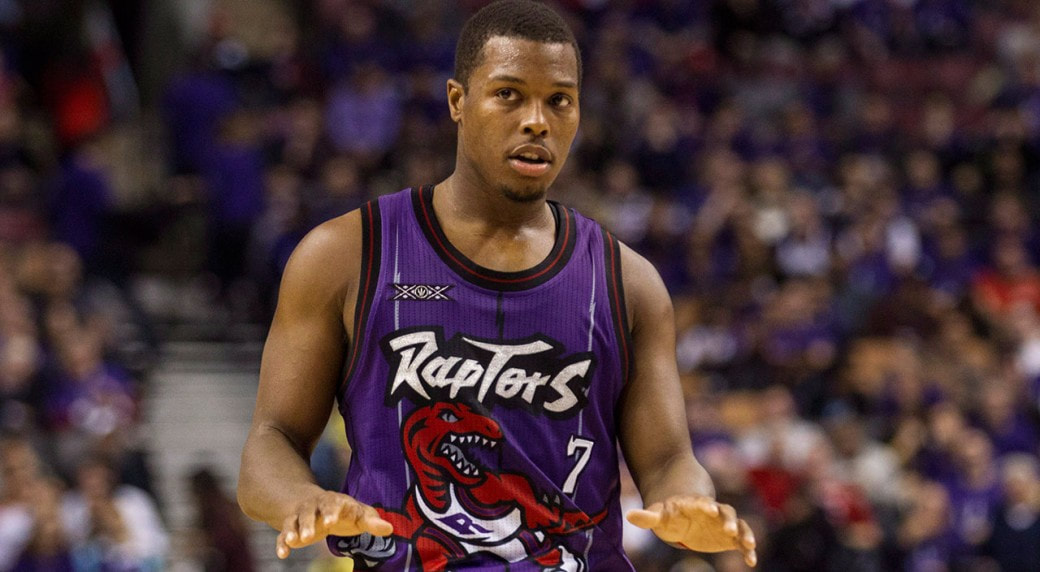
This is one of my favourite basketball jerseys ever because it is absolutely just that damn awesome. When the Toronto Raptors expanded into the NBA the big craze in Hollywood was still the Jurassic Park movies and dinosaurs in general; so what's more badass than a velociraptor that's playing basketball on a jersey. The Raptors colour scheme of purple, red, white, and black was always something that made them stand out too. Top of the awesome front of the jersey with the badass raptor with the back of the jersey's names being outlined in what I can only describe as stegosaurus spikes. It was so amazing that when Toronto switched to a more subdued purple jersey, then just red, etc. fans have always clamoured for the raptor to return and now you will occasionally see the team bust out the raptor jersey every now and then (as evidence from Kyle Lowry wearing it above).
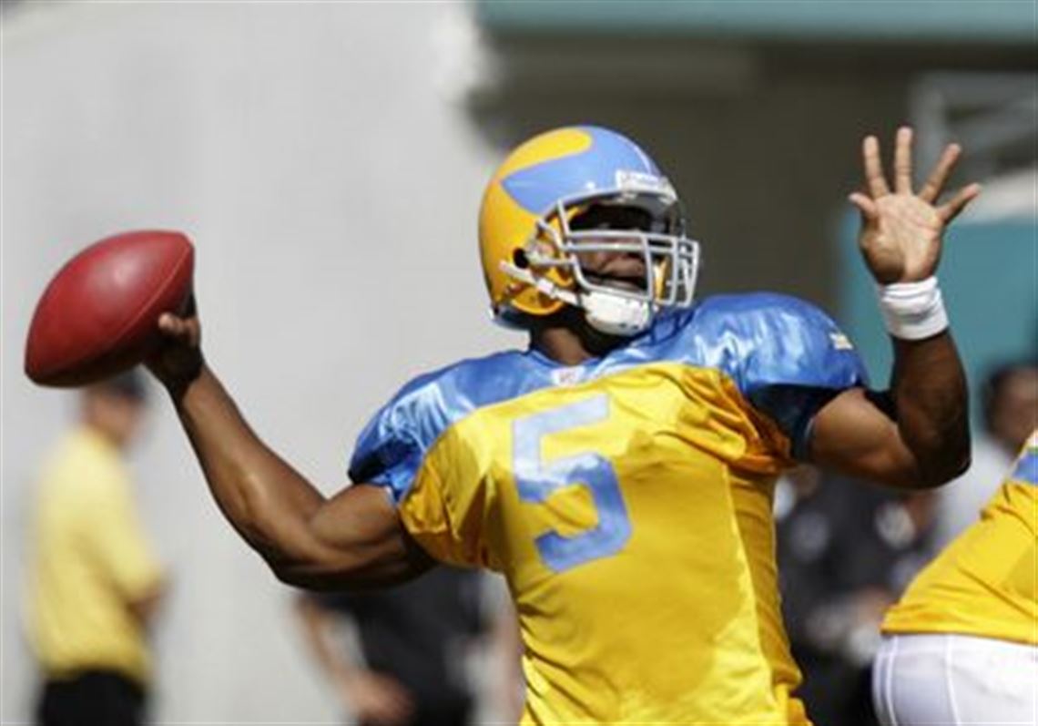
#2) VANCOUVER GRIZZLIES
A team that left the league too soon, had one of the cooler jerseys and ESPECIALLY logos in the league. That isn't to say that Memphis has been a slouch, they've always had a great look in jersey and logo too but nothing can top the original because of how special it was. The logo we'll start with, a giant grizzly crushing a basketball with the team name above it, that's amazing and again I love badass animal logos. Then we look at the awesome colour pallet: teal, black, red, white, and brown which in and of itself is a sick colour set. Place it altogether on a jersey and the home teal ones look great with the white numbers and logo lettering and the away white ones with the teal lettering and numbers. My favourite part of the entire jersey though is the arm hole and neck hole striping. It's done in a west coast aboriginal art style, as I mentioned with my Vancouver Canucks jersey is something I love because the team is incorporating the art of the indigenous peoples of the west coast of Canada into their jersey. The whole thing put together is fantastic, so fantastic that I was glad that Memphis brought it back as a jersey to wear, and it even says Vancouver on it too even though their still in Memphis; it's amazing and classic and much appreciated. As we can see with the picture of Ja Morant in the Vancouver Grizzlies jersey even though he's a young gun for Memphis right now and I hope they continue to bust this jersey out.
#3) ATLANTA JAWKS - HAWK COVERS THE JERSEY
With the classic red, white, and yellow jersey of the Dominique Wilkins era gone, you would figure that it's replacement would either be a dud or something amazing. I don't know what other people thought but my feeling is that the Atlanta Hawks replaced their classic jersey with one of my favourite NBA jerseys during that time. They added black to their traditional red, white, and yellow colours and did a jersey fade from black to red and on it separating the colours was the new logo of the Falcons, a super badass looking red falcon clutching a basketball in its talons. If you can't tell, I'm a big fan of jerseys that incorporate badass animals on them. Yes, during the Dekembe Mutumbo era of the Falcons, they wore this jersey and I love it: the fade from black to red, badass falcon on the jersey, the new logo is that badass falcon, very unique yet still sticks with the identity of the Atlanta Hawks.
#4) BOSTON CELTICS - GREEN, BLACK, & WHITE
The classic Celtics jerseys are amazing, just that great white on green or green on white, pure classic and awesome. While those are amazing jerseys my personal favourite Boston Celtics jersey ever was the one they first started using during the Paul Pierce/KG/Ray Allen days. It was the typical classic Celtics jersey but the numbers were black and outlined in white instead and the whole jersey had black trim. I think it's because I'm a huge fan of black and found it made these jerseys just pop out there. Green, black, and white just vibe so well together; later on the Celtics introduced a black jersey with green names and letters outlined in white since this jersey went over so well. I just find it to be a classic jersey for the Celtics championship era that made them one of my teams to root for.
#5) CHICAGO BULLS - THE MICHEAL JORDAN JERSEY
I call it the Micheal Jordan jersey but it's honestly just the default Chicago Bulls uniform. However, when you see that red jersey with the black numbers and name outlined in white you only think of Micheal Jordan when it comes to the Bulls. It's iconic, it's classic, and red, white, and black just vibe together so well. The Chicago Bulls have one of the best jerseys ever in the NBA.
#6) UTAH JAZZ - THE MOUNTAINS
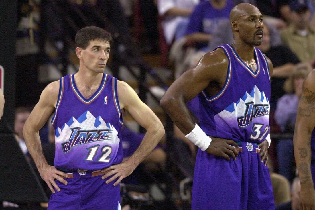
While I've felt over their entire history that the Utah Jazz have had great jerseys, this was by far their best ever. I know it didn't incorporate the J into a musical note (for jazz music) the way the other jerseys had but it did incorporate another thing that is key and important to the Salt Lake City area and the state of Utah; the Rocky Mountains. These jerseys kept the purple of the old Jazz but added a white and blue to create a new logo name and to put that on top of the Rocky Mountains on both the home and away jerseys. They also used a new and cool number style, it was just generally great all around. While the Jazz did go back to using their old logo and jersey style in this current time, I will always have a soft spot for these because they looked amazing and these were the uniforms that the great Karl Malone and John Stockton wore when they took Micheal Jordan and Scottie Pippen's Bulls all the way to Game 7 in the NBA Finals one year. It's a jersey I definitely think Utah should wear as an alternate again, instead of that hideous orange one they have.
#7) PHOENIX SUNS - THE CLASSIC SUN
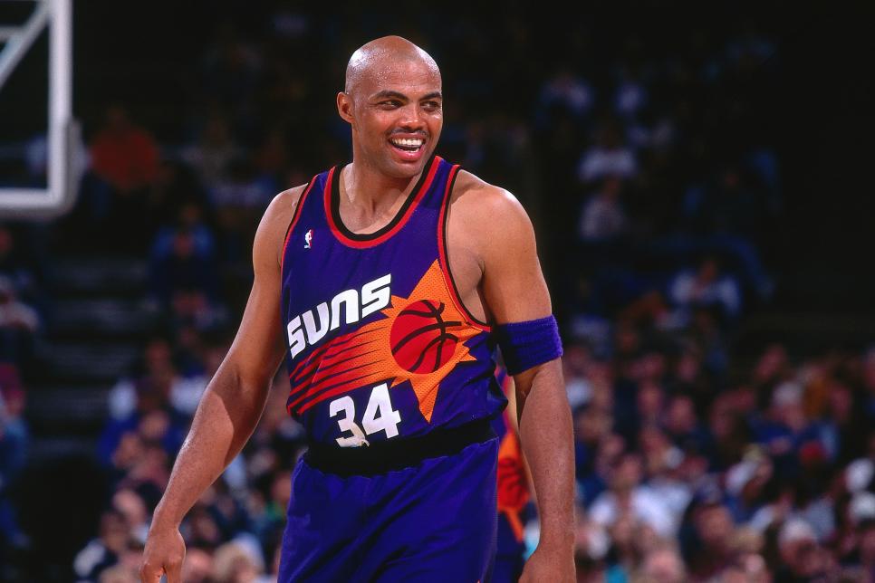
The Phoenix Suns have had a LOT of jerseys over the years and most of them have been big misses honestly. It hasn't been until now that they have had acceptable jerseys again, the problem being they switched their jersey to something hideous from something so cool. The Charles Barkley era jersey is just that damn good. It is either purple or white depending on home or away with that basketball sun blazing across the jersey with the name of the team and decent number style. It also had the flying basketball sun on the shorts leg as well. It was just so classic that when they switched to I believe it was just all purple or just all orange next, it crushed the style of the Suns and got rid of one of basketballs best jerseys. And Phoenix's jerseys hadn't recovered until these past couple years, I'd like to see these old ones make occasional appearances though I doubt it with their current jerseys and "The Valley" one being so nice.
#8) MILWAUKEE BUCKS - FEAR THE DEER
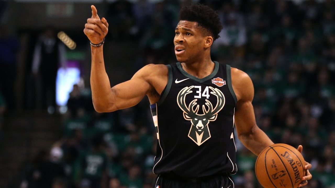
When the Milwaukee Bucks did a re-brand a few years back I remember thinking wow this logo is so badass (again with me thinking badass animals make jerseys 10x cooler) but the green jersey that said Bucks and the white one that said Milwaukee just seemed to be missing something. Then the team announced they'd be doing a black alternate jersey and even an alternate floor layout for the special nights they'd call "Fear the Deer"; a new slogan to show off the tough looking logo and the tougher team. I can tell you one thing, the "Fear The Deer" black jersey with that new badass buck on the from of it with the number in the horns and the nice striping down the side. Matched only by the fact that they redo the arena to match. It's just that amazing. Like, it's so cool that I'm disappointed when Milwaukee doesn't use the jersey; it is by far one of the current NBA's (and maybe old NBA's) best jerseys.
#9) MIAMI HEAT - BRIGHT MIAMI LIGHTS
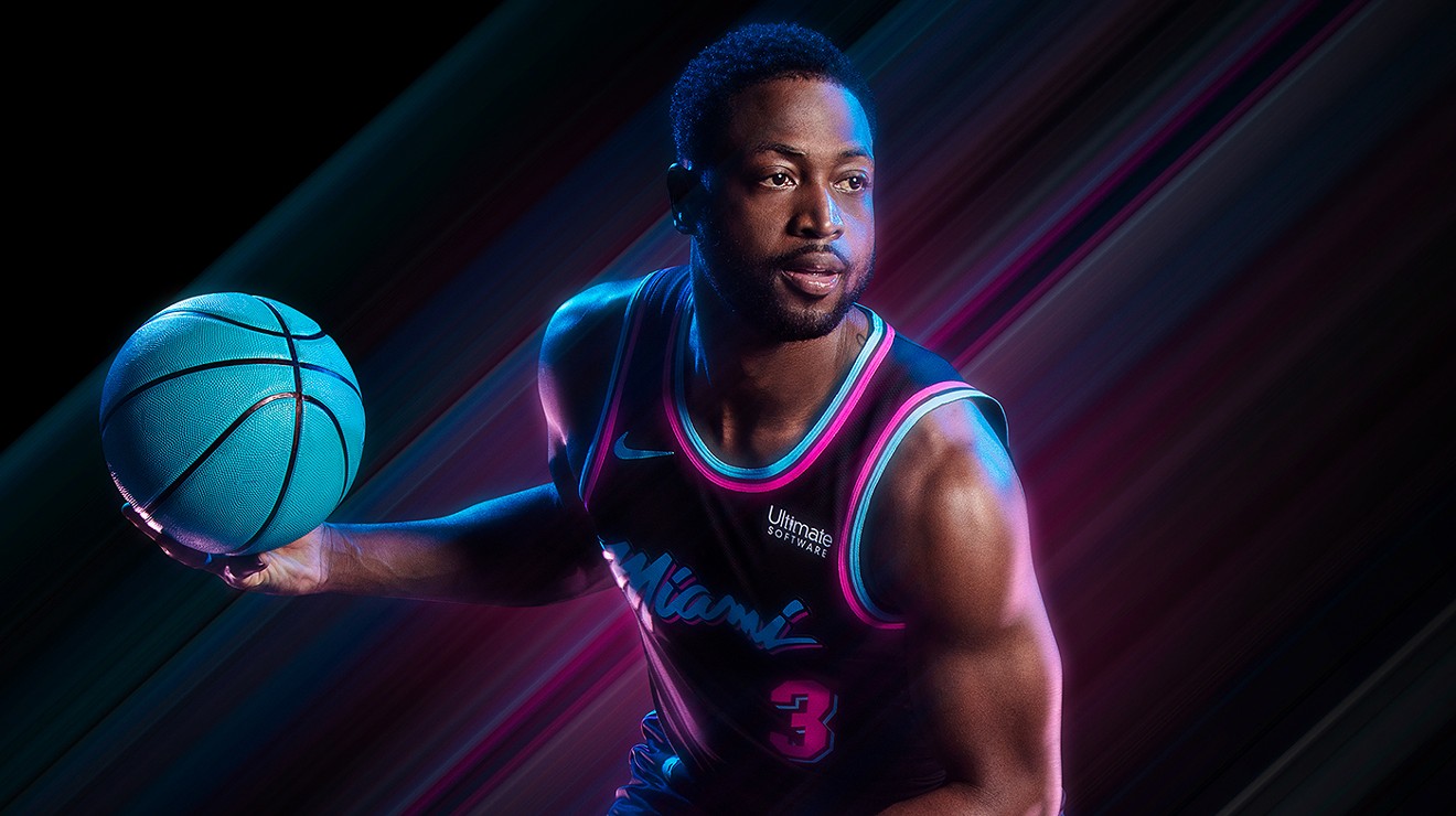
I don't know if this jersey had a specific name but this ended up being a jersey that came out near the end of Dwayne Wade's career and it was spectacular. While the regular Heat jerseys are nice, the best thing about these is how it plays off of the city of Miami itself. Miami is a bustling city with an intense night life and has always been seen that way, reaching all the way back to the 1980's, if you think of things like Miami Vice or Scarface you think of the bright lights of Miami nights. The Heat decided to play off of that and do black, teal, and fuchsia jerseys to play up those bright lights. The jersey looks incredible because it's so striking and it screams Miami, it is only an alternate. It's an alternate that I think the Heat should adopt as their permanent jersey it is that nice.
#10) CHARLOTTE HORNETS - THE SECOND COMING
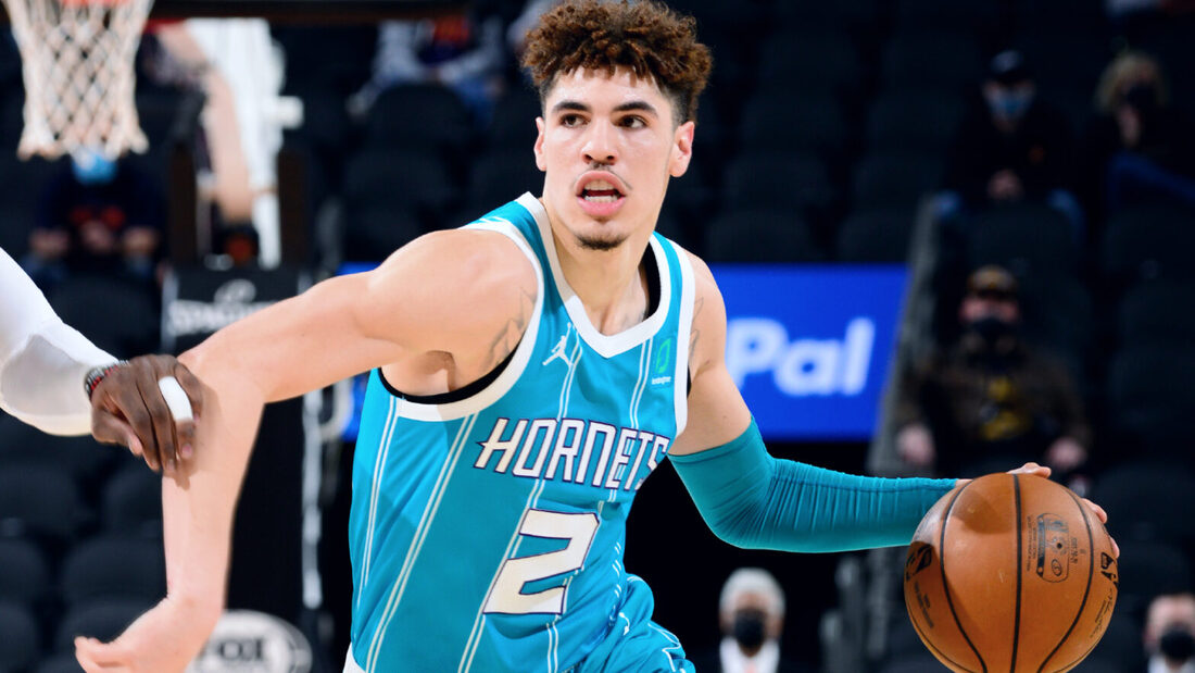
Why the Charlotte Hornets you might ask, well it's pretty simple to me, the Hornets were a great organization that fell into some rough times that had to move to New Orleans. When they became the New Orleans Hornets they kept things similar to their original look for a brief amount of time before switching to the Pelicans with the Hornets vanishing completely. Around the same time Charlotte got a new team, the Bobcats, and they were horrendous in so many ways especially their look. However, lets fastforward to now. The Charlotte Hornets have a new badass logo, not as cool as the original but still awesome. They've somehow improved the look of their stylin original jerseys, with the new style numbers and letters and not only are the home and away jerseys with that classic teal and white look sick but Charlotte has one of the few abbreviation jersey and one of the few "City" jerseys in the NBA that are actually good. Their "Buzz City" is such a cool play off the original with just enough uniqueness to make it special and the CHA (short for Charlotte obviously) is done on a cool purple jersey. Lets add all of this to a new look team led by LaMelo Ball and the Charlotte Hornets are looking fresh.
MY UGLIEST 10 - NO SPECIFIC ORDER
#1) T-SHIRT SLEEVED JERSEYS
It's not only just me but the NBA players themselves showed a general hatred towards these jerseys. The "t-shirt" or short sleeve jersey was an absolutely dumb idea because they looked awful. They were essentially just a t-shirt with an ugly looking version of the logo on the front of the jersey. There's no way to explain how bad they are, like most NBA players that liked wearing short sleeves wore a compression short sleeve with the jersey over top, which always seemed okay, and even they hated the short sleeve jerseys. They were ugly and universally hated, most people are glad they are gone forever.
#2) NBA 2021 "CITY EDITION" JERSEYS
The "City" jerseys are another jersey that is an absolute stain on the history of the NBA, while some jerseys in this style aren't bad like Charlotte's "Buzz City" or Cleveland's old one that just said "The Land", most of these are absolutely disgusting jerseys. There are poorly designed and terrible variations of the team name like Brooklyn or Cleveland have. They make no sense like Atlanta's MLK jerseys for Martin Luther King Jr. (their old Peachtree one made sense but not this). In the worst case, they bastardize the logo like the Celtics have where it literally says in terrible font BOSTON CELTICS rather then just Celtics or Boston on it. There are a few "City" jerseys that are acceptable like Charlotte's "Buzz City" or Golden State's "Oakland" one, but mainly they are tremendously garbage and they should all just burst into flames.
#3) THE "LATIN NIGHTS" JERSEYS
For some reason, the NBA has these really dumb ideas sometimes for their jerseys; the "Latin Nights" ones were no exception to this rule. It's a neat idea IN CONCEPT, but in practice it comes out as terrible and they all looked awful, I mean not as hideous as the short sleeve jerseys but on the same level as some of the dumb city jerseys. Basically, lets pick certain teams that are close to the Mexican border or have a higher concentration of Latino people. The Miami Heat, New York Knicks, Chicago Bulls, San Antonio Spurs, Phoenix Suns, Los Angeles Lakers, Dallas Mavericks, and Orlando Magic were the teams chosen for such an honor. Honestly, it was such a cop out because with the exception of New York becoming Nueva York, every single jersey was "lets simply put Los or El before the team name". Los Lakers, Los Bulls, Los Suns, Los Mavs, Los Spurs, El Heat, and El Magic adding in Nueva York and the jerseys looked sad. If you plan to appeal to the Latino community by doing a "Latin Nights" jersey, have some people of that heritage give input, make them stick out and be fancy. I wish they tried harder, but right now this was just another failure of a jersey.
#4) TORONTO RAPTORS - THE "TRIANGLE" JERSEY
The Toronto Raptors have always had great jerseys, from their amazing Raptor jerseys that I've shown above to even the simple purple jersey and the simple red jersey. But then it started with the jersey with the "triangle" that just said North, which I thought was bad enough because it was just an alternate. WAS just an alternate but now the Raptors are using three different variations of that "triangle" style plus the North jersey so now there's a home, away, alternate, and North jersey all done in that ridiculous style. What can I explain about it, it's the way Raptors is placed on the jersey that bothers the heck out of me; it bothers me because this is a franchise that has consistently had great jerseys over the years. Now there's this garbage, which I have to hope for another rebrand sooner than later for the Raptors sake.
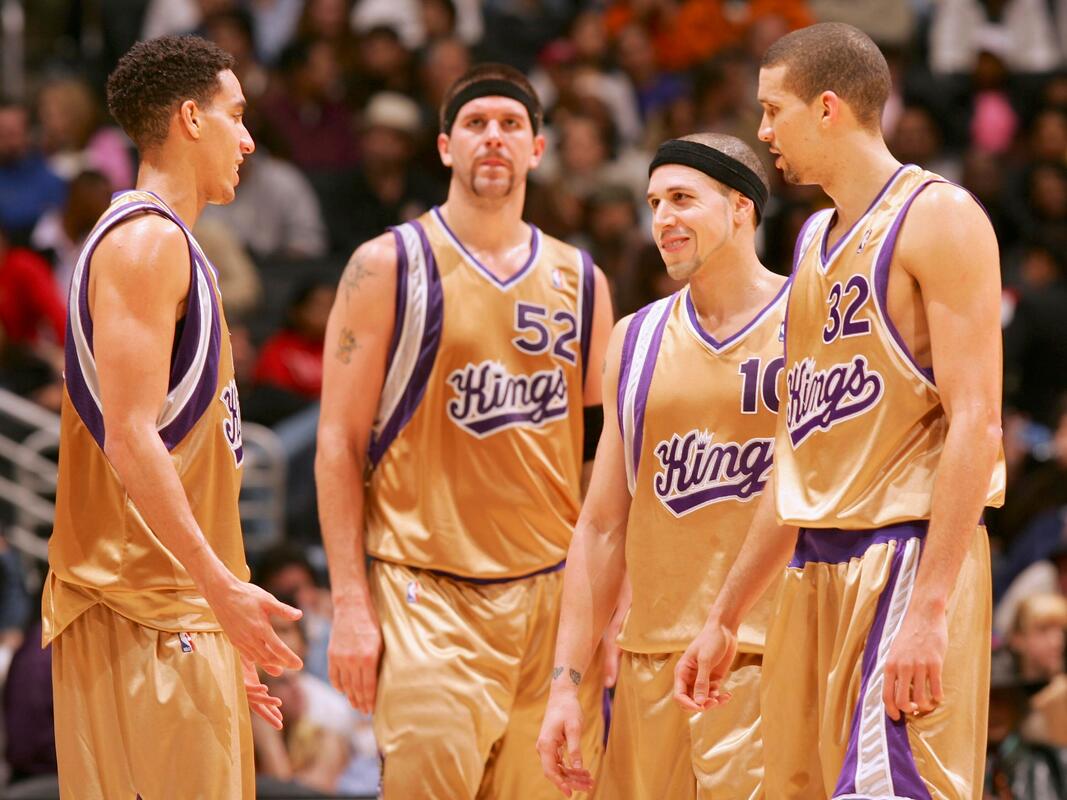
#5) SACRAMENTO KINGS - GOLD JERSEY
The poor, poor Sacramento Kings.........never a winner in games or jerseys. I think total the Kings have only had like 2 acceptable jerseys in their history, the rest have been hot trash. THIS ONE IS ESPECIALLY HOT TRASH. The colours of Sacramento: purple, black, and white so then they release this terrible gold jersey. I understand that the whole purple is a regal colour and lets match it with gold for a kingly look but it did not pull off any kind of royal look to me; in fact, it made the Kings look more like the jesters of the NBA they are. What's to say, it has terrible font, it is a terrible colour, terrible number placement, terrible stripes, it's just terrible. Luckily, their alternate now is a pale blue with a lion wearing a crown in a more English looking regal version, still not great but much better than this attempt at seeming like Kings.
#6) LOS ANGELES CLIPPERS - LAC JERSEY
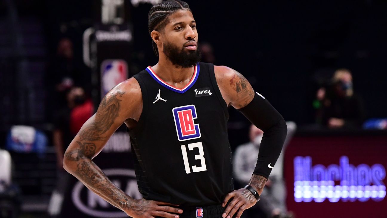
Honestly, ever since they rebranded from the Chris Paul and Blake Griffin era style jerseys to their current ones the LA Clippers have always had terrible uniforms but none have been as bad as the LAC one. It's only saving grace is that it's a black jersey, but the logo is what does it, the logo on the chest, that big LAC kills the entire look of the jersey in one go. If the Clippers got rid of that, their home, and away and just stuck with those newer black and white jerseys that say Los Angeles on them in the "hood" style font, I think those would be great. But ya, the logo for this kills the entire jersey.
#7) WASHINGTON WIZARDS - GOLDEN ERA
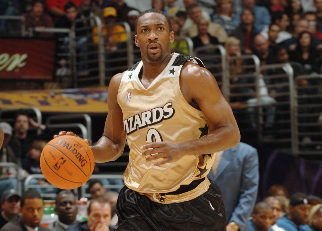
The Washington Wizards have always had an on again off again look, this one during Gilbert Arenas days of being a Wizard, was atrocious. Some people might like it better than the blue, gold, black, and white they used as their inagural colours and much better than now that they use red, white, and blue; those people are all incorrect. This was just, it didn't make sense with the teams name. It didn't make sense with the logo colour because they still were using the blue logo and when they started using red, white, and blue they changed the logo to those colours; it just never fit as part of their look. There were stars and stripes so they tried to do a USA look without the USA colours, if they had pulled the trigger on the colour change then this jersey would've looked much better in red, white, and blue. It just never really sat well to me.
#8) CHARLOTTE BOBCATS - INAUGURAL JERSEYS
Poor Charlotte, the Hornets were doing well, they were a decent team and then they got sent to New Orleans and the worst part..........the team owner decided to keep the Hornets name so even when you finally got a team back they couldn't be the Hornets. Granted that changed when New Orleans became the Pelicans and Micheal Jordan bought the Hornets but this was before that. They became the Charlotte Bobcats and EVERY itteration of the Bobcats jerseys but especially their inaugural ones were just terrible. The colours, the font, the numbers, the just everything was awful. I can't put my finger on just one thing, it was the whole package that was just terrible. I'm so glad that the Hornets name, logo, colours and everything came back into the league and the Bobcats disappeared.
#9) DENVER NUGGETS - RAINBOW JERSEY
I know this is a version of the original style of Nuggets jersey but it's a style of jersey that I was never down with. When the Nuggets switched logos in the Mutumbo era to that navy, red, white, and yellow colour and then in the Carmelo era that power blue, gold, and white that was the Nuggets stuff I preferred. Even the current Nuggets REGULAR jerseys and logo are fine, it's just when they bust out this jersey I think it looks just so weird. I can't really explain my dislike other than I thing it's ugly, the colours clash, the logo of the city cut of the mountains is lame, it's just a jersey that I find is sadge.
#10) INDIANA PACERS - LOGO AROUND THE NUMBER
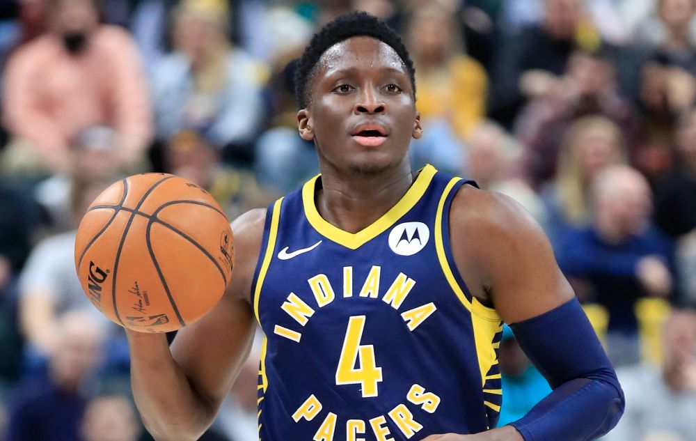
The Indiana Pacers have always had some sick looking jerseys and that's why this one is so troublesome. The nice styled stripe ones from Reggie Millers days, the newer ones from Paul George's days, the old old one, they were all very slick and very nice. Then this one, poor Victor Oladipo not only did he end up stuck leading a bad Pacers team but he ended up with worst Pacers jersey ever. The full name Indiana Pacers going around in a circle around their number, it just looks so bad. The rest of it looks nice still but the main part of it, the front of it, the part you see most, is garbage. There's no nice way to explain it besides just garbage and hopefully the Pacers change it for their sakes to bare minimum something they used to use.
THE MLB
MY BEST 10 - NO SPECIFIC ORDER
#1) NICELY PUT TOGETHER PINESTRIPE JERSEYS
I love pinstripe jerseys, because they look so awesome, as much as I hate the Yankees their uniform counts towards this as well. That's simply all I have to say, pinstripe jerseys like the White Sox, Cubs, etc. have are (if put together correctly) some of the nicest jerseys that exist out there. There's a few exceptions to that rule but for the most part, these organizations put together some sleek jerseys.
#2) BOSTON RED SOX
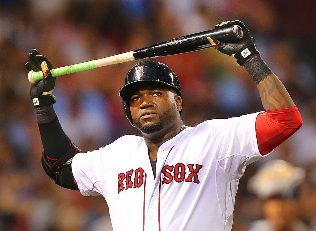
No list is complete of best baseball uniforms without my favourite team's jersey and not just because they are my favourite team, no just because the Boston Red Sox have had one of the nicest, slickest, cleanest jerseys in the history of the MLB. That's a big statement but the fact that all that has happened to the Red Sox jersey in the over 100 year history of the team is the most miniscule of changes speaks volumes about how great this uniform is. That's all I need to say, it's historic, it's beautiful, the contrast of the red and white with simple navy blue lines are just great. The perfect uniform basically.
#3) NEW YORK METS - BLACK ALTERNATE JERSEY
The New York Mets came out with, in the Mike Piazza days of the late 90's and early 2000's, this jersey which I simply call their black jersey. Typically the Mets logo on their hat is orange with a blue hat, now they had a black hat with either a blue brim w/an orange logo outlined in blue or an all black hat w/ a blue logo outlined in orange. Then their jersey is normally white at home, with an orange logo highlighted with blue but with this alternate home jersey it was black with a blue logo highlighted with orange. Nice blue trim around the jersey, good white outlines on the lettering. I think that the Mets should bust this out as their home alternate on a more consistent alternate basis in comparison to their alternate blue on that they use on occasion. The colours together and everything about this jersey just screams awesome.
#4) LOS ANGELES DODGERS
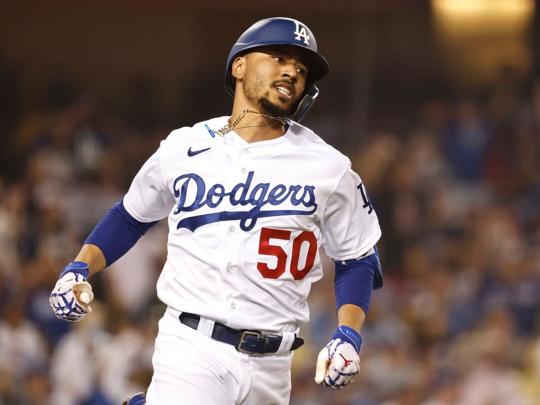
One of the nicest and slickest jerseys in the MLB is one of my favs, the best way to describe the Los Angeles Dodgers uniforms is the perfect mixture of a great logo, colour palette, spacing, and design. The word Dodgers stands out well because it's in a sharp blue on a crisp white jersey and the font used in the logo is nice and clean. The numbers are done in the classic "athletic" style of the blocky numbers but in a sharp red that shows up great on that crisp white jersey. The numbers on the back though are in blue to match the team name and player name too. The hat logo is on the sleeve, which adds a nice touch. Speaking of the hat, that is the most iconic thing about the Dodgers; the LA logo is seen in many places and it's iconic for many things. Just though, in general, it is a very nice hat, all blue with a white LA logo. The other thing is these jerseys are classics, the Dodgers have been using this jersey or ever so slight variations since they were the Brooklyn Dodgers back in the day. That's how great they are, if a team has to barely modify a jersey over a 100 years of being around, then it's definitely a jersey that deserves all the credit in the world. I love this jersey.
#5) ATLANTA BRAVES
I think that the Atlanta Braves using the team logo and tomahawk on a clean white jersey, with nice red and navy striping on the trim is just such a great look. I don't have much to say on the Braves jersey other than the logo's look along with the overall layout and design of the jersey just makes this one of my favs.
#6) MIAMI MARLINS

When the Florida Marlins changed their name to the Miami Marlins I thought it was a mistake, then their jersey was released along with their hat and I thought it was just okay. They've finally updated it and now I love it, they pulled the trigger on what I think the Miami Heat should do. While the Miami heat use that pink, black, and teal jersey as their city jersey and give off that "bright lights of Miami" feel, it is only occasionally, whereas the Marlins saw that and thought this is brilliance. So they decided to go with a black, teal, and pink colour scheme to do a whole "bright lights of Miami" look; the thing about this look and its contrast amongst colours is that it is just so great. It screams Miami. And that's what I love so much about it, improving their logo to meet somewhere in between the Miami and Florida Marlins look, and taking the colours that I associate with Miami and putting it all together. It is a high class jersey that I love in the majors.
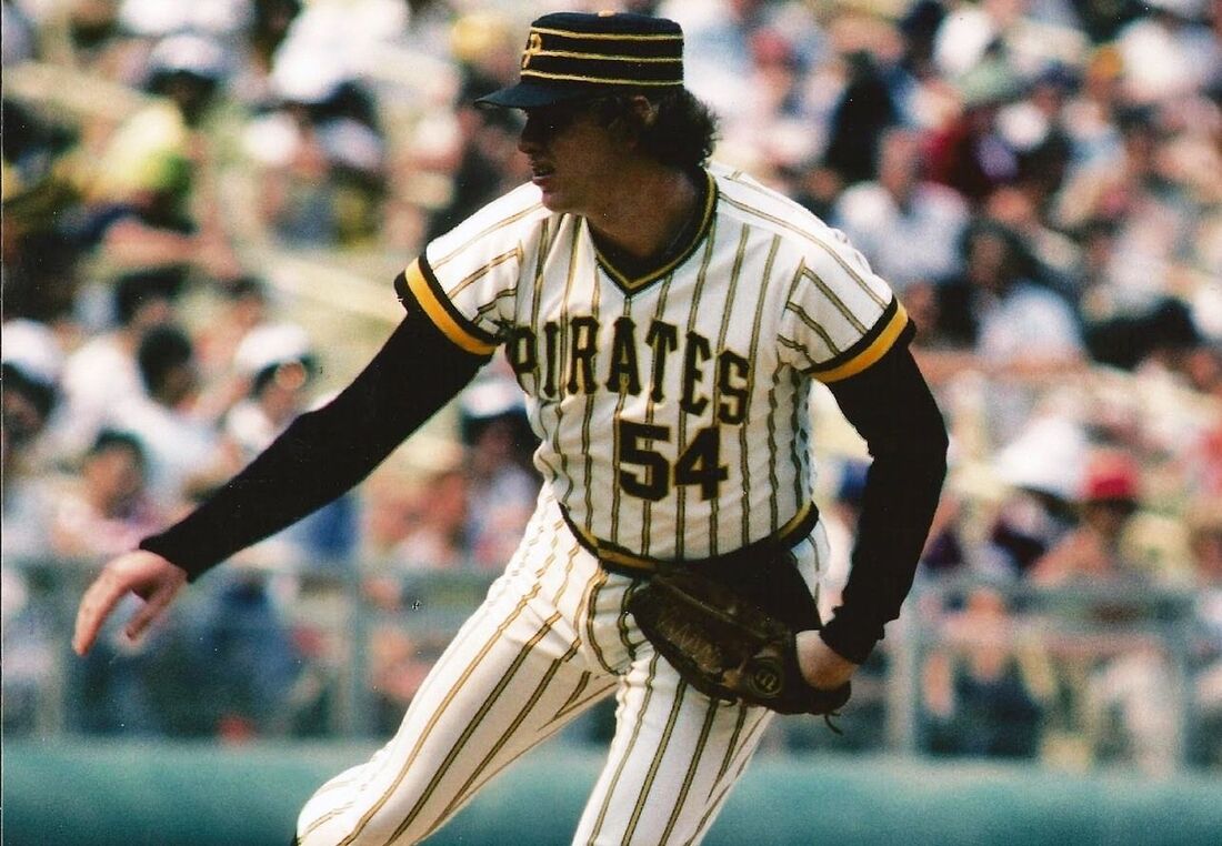
#7) PITTSBURGH PIRATES - BLACK ALTERNATE JERSEY
The Pittsburgh Pirates honestly have a curse, of ups and downs, then they are blessed with good players for a brief period and this awesome jersey. Probably beforehand but I remember these nice black Pirates jerseys with the yellow P that is outlined in white making themselves shine bright during the Andrew McCutchen, Russell Martin times. I just find yellow and black so nice together colour and contrast wise, the P being outlined in that fancy white (which is one of the two versions of their hat that I like). It's just such a nice jersey and yes while their regular ones are nice and cool looking, this is where they shine and this is one of my favourite jerseys in baseball.
#8) SAN DIEGO PADRES - CURRENT JERSEYS
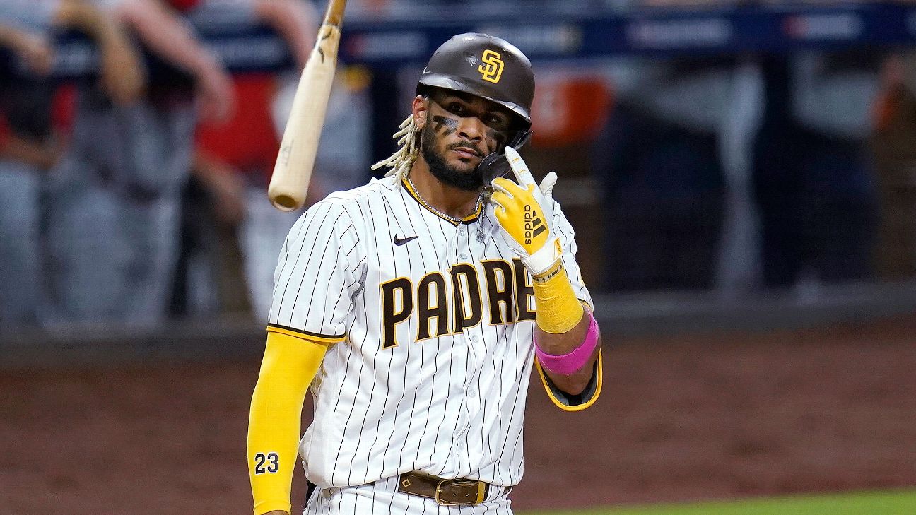
The San Diego Padres have been wracked with some terrible jerseys in the past, particularly the 70's and 80's. By the time I started paying attention to baseball it was the late era of Tony Gwynn Jr. and Trevor Hoffman, by then I thought the Padres had some nice jerseys and then they got even more clean and nice afterwards. When they said they were going back to using their old colours (the ones from the 70's and 80's) I was like, "oh shit well these are gonna be hideous way to ruin those simple, clean, and nice jerseys you had San Diego." Then they showed guys like Fernando Tatis Jr and Manny Machado wearing them, wow, did they manage to take the old colours (which didn't look to bad together to be honest) combined with that fresh look. It was awesome, I loved them, all three jerseys that Padres currently rock are awesome.
#9) BALTIMORE ORIOLES - BLACK JERSEY
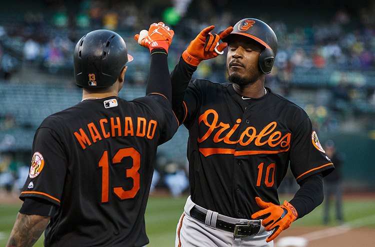
This is one of the only good things about the poor poor Baltimore Orioles. These beautiful black and orange jerseys, they are crisp and very clean jerseys because they have that beautiful "Halloween palette" which basically says to me that anytime orange and black come together they just feel like they fit so well. That's one thing, this jersey is just very plain and simple which is one of my favourite things, simple and clean is perfect. The fact that the jersey is just two colours and they provide such a beautiful contrast is perfect to me, it's one of the few things the Orioles actually have going for them and I'm glad they tend to use it frequently.
#10) TORONTO BLUE JAYS - BLUE JERSEY
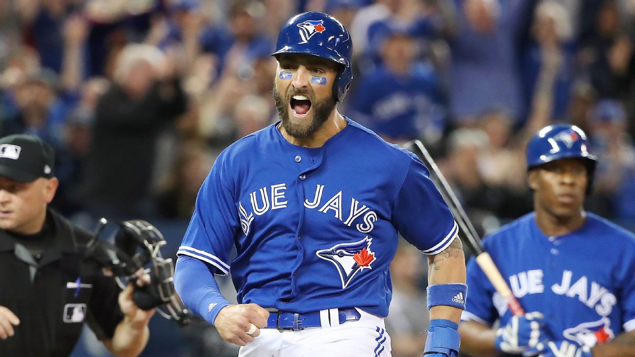
When the Blue Jays started going by their original name again and not just Jays, this was their first attempt at a new jersey and logo. The nice thing is that it is a combo of new school and old school. It is the old school font, the old colours. The new logo is a sharper and crisper version of the old one. And the jerseys themselves are also sharp and crisp, while both the white home and grey away ones are nice my favourite was always the nice blue jersey with white pants. It always came across as a very well put together jersey and something the Blue Jays should be proud of to wear (unlike the trash they wear now more on that in soon).
MY UGLIEST 10 - NO SPECIFIC ORDER
#1) ANY & ALL TEAMS USING POWDER BLUE (EVEN IF IT'S A TEAM COLOUR)
The amount of powder blue jerseys in the MLB is awful, the teams that have that colour like the Tampa Bay Rays and Kansas City Royals can barely pull it off, so why would you use it when you don't have to. I get the Blue Jays used it in the past and the jerseys looked TERRIBLE then but why bring it back when I thought over the past several years they found the perfect balance between old school and new school; so why the powder blue to ruin those jerseys. My biggest question is this.............if your team didn't have blue in, why the hell did you use a powder blue jersey and if it did and it was a dark blue only, why did you use a powder blue jersey. Powder blue jerseys are the bane of the MLB, they shouldn't have been seen but let's keep them away please because they're just terrible.
#2) "CITY CONNECT" JERSEYS
Nike has this bad habit of coming up with dumbass ideas that these leagues insist on following through with, and much like the NBA's City jerseys, they gave the same nonsense to the MLB just with fewer jerseys. Boston Red Sox, the Chicago Cubs & White Sox, Miami Marlins, Arizona Diamondbacks, Los Angeles Dodgers, and San Francisco Giants all got stuck with one of these hideous things. Out of all of them, only the Chicago White Sox had a cool one, so 1 for 7 is pretty rough. What's to say about them. Why the hell is Boston's jersey yellow and blue ? Wrigglyville, c'mon that's pathetic ? Miami's jersey looks terrible. The Serpentes, is that even the proper word for snake in Spanish, let alone a specific snake like a Diamondback Rattlesnake ? Just a fading G for the Giants ? A hat so hideous that the MLB should never allow it ever for the Dodgers. Like, what the fuck are these even. They are terrible.
#3) "TURN BACK THE CLOCK" JERSEYS
So while trying to find pictures of the jerseys I thought were ugly like the powder blues and the others on this list, I stumbled on these, I don't remember these being a thing back in 1999. And that's probably for the best because HOLY SHIT THESE ARE AWFUL. These are by far some of the ugliest, dumbest jerseys I've ever seen. Look at that Pirates one, I like it when they occasionally bust that Pirate out on the one hat they have, but covering the entire jersey, that's just gross. Why are those the Mariners jerseys, that's not even their colours ? And how do you make the Athletics jersey look worse than that ugly 1970's ones they had ? These three are only the tip of the iceberg, they're ALL that bad, everyone had one.
#4) CHICAGO WHITE SOX - "SOX" JERSEY
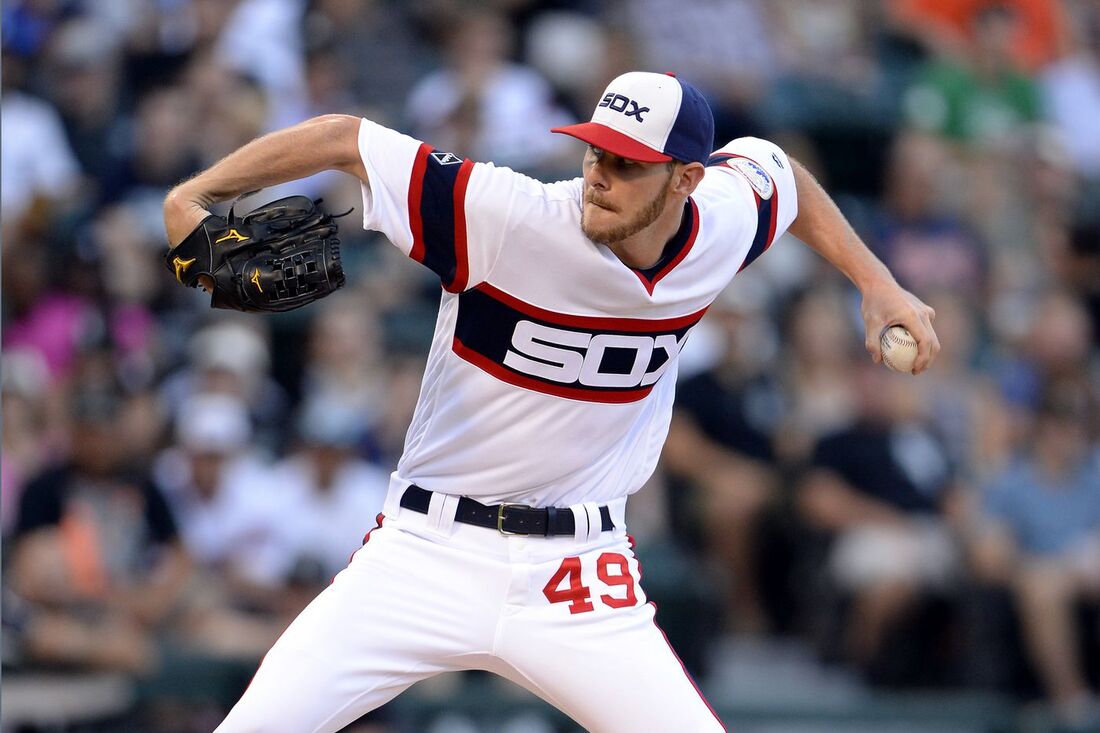
The Chicago Cubs have worn the same jerseys forever, whereas their crosstown rival Chicago White Sox, have worn these hideous things through the 70's and 80's (I'm not sure about early 90's I don't think so) but ya when I got a Sammy Sosa rookie card, that was my first time seeing that jersey. It nearly made me gag. The reason being is that both home, away, and alternate the Chicago White Sox jersey is fantastic and I love them. The stripes on the jersey, the colours matching the Cubs rather than being different, the fact it says SOX on the jersey and hat, number on the PANTS of all places, they make me gag. The fact Chicago brings them back sometimes is a terrible idea, they should never see the light of day again.
#5) ARIZONA DIAMONDBACKS - "DIAMONDBACKS" ALTERNATE JERSEY
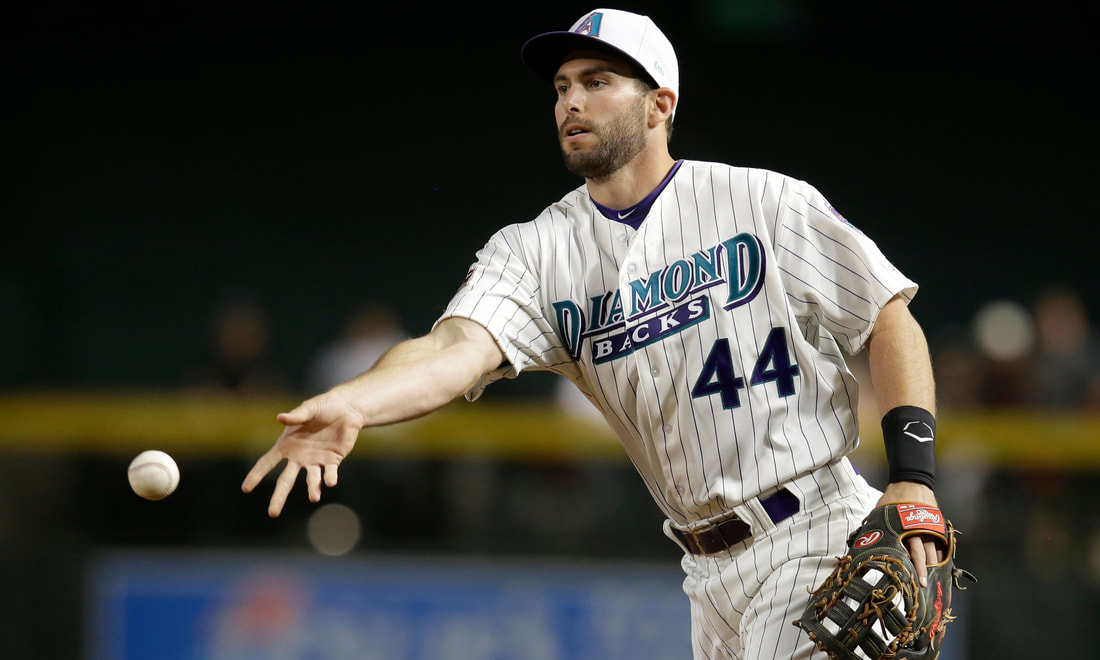
When the MLB expanded into the desert of Arizona, I was excited, they had a decent team and even won a World Series. Their home and away jerseys were cool, being like sleeveless with a t-shirt underneath and just they were so cool, then there were these. The worst part was that they messed with the perfectly good purple hat and made it white, which makes it look awful. Then lets add that we're taking away the cool Diamondbacks logo on the jersey and just putting the words Diamond backs, it's just is so awful because it's an alternate yes but it looks like its meant to be a home jersey and when you compare it to their home jerseys they're awful. Luckily, Arizona has different colours, different alternates, and more today. These will never see the light of day again.
#6) HOUSTON ASTROS - 1970's JERSEY
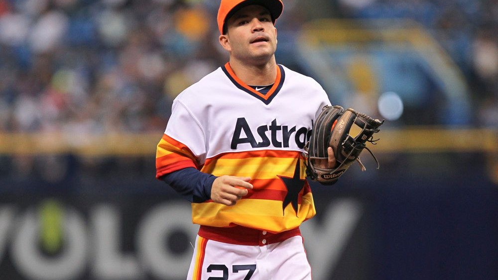
The Houston Astros have had some cool jerseys in their history like the ones in the Randy Johnson, Craig Biggio era or the ones they wear currently. But this one from the 1970's has always been awful, it's hideous stripes along the bottom that take up half the jersey with a massive blue star in it, the word Astros is in dumb font, and the absolutely dumb "rainbow" that's just yellow, red, and orange. It is honestly just one of the dumbest things and I have no idea why the Houston Astros ever thought it was nice, let alone nice enough to bring back as an alternate jersey from time to time.
#7) KANSAS CITY ROYALS - SLEEVELESS "GOLDEN" JERSEYS
These gold helmet/hat, canary yellow, with powder blue short sleeved/almost tank top monstrosities are the dumb jerseys that the Kansas City Royals wore for a brief time in the 90's. I can't speak in words how awful they are. Let's start with the gold helmet which could be neat but with the logo tilted and the just general everything it was dumb. Short sleeve gold and powder blue jerseys that are just terrible to look at, compared to the jerseys the Royals rock now and the ones they wore in the 80's and rest of the 90's, these stood out like a sore thumb. Thankfully, Kansas City never wore these again.
#8) DETROIT TIGERS - DETROIT STARS THROWBACK
I get WHY the Detroit Tigers used these jerseys once, but gawd damn like they are hideous. The name and letters are done in that garbage oldie time lettering but that's not the problem because that's when they were used; thing is that it just looks ugly. Especially the R in Detroit being on a really ugly navy blue collar that goes down to the belt. There are other more tasteful old jerseys, even from that particular league, it's just so ugly for me that I'm glad the Tigers only ever wore it once.
#9) PITTSBURGH PIRATES - 1979 JERSEYS
I think the Pittsburgh Pirates have genuinely been cursed with a few things over the years and these jerseys they wore in 1979 were one of the worst curses in Pirates history. First off, lets start by saying that pinstripe jerseys can be nice but when the stripes are this large and stick out this bad it looks very bad, like very bad. Then we'll talk about the thing that's most egregious of all, the hat. I love baseball hats, I have a ton of them and am trying to collect one at least for every team, and this hat absolutely hurts me. It's flat on the top, it's got yellow circles around the whole thing that kind of match up with the flat top, and those yellow circles clash with the logo. It's a terrible jersey and I hope the Pirates never ever bring it out again.
#10) TAMPA BAY RAYS - THROWBACK THAT'S NOT A THROWBACK
This is a pretty simple explanation, the Tampa Bay Rays created two things: 1) a hideous jersey and 2) called it a throwback without having a team old enough to have a "throwback". IF Tampa Bay wanted to do a throwback jersey and not use their current Rays uniform, they should've used their old jerseys that said Tampa Bay and Devil Rays in the rainbow font......that's a throwback. These jerseys are coloured nothing like anything Tampa had, like it's far too bright and they don't use yellow. The font and numbers are terrible and it's definitely a look you'd see reminiscent of the awful 1970's San Diego Padres jerseys that almost made my ugly list. Tampa, listen, use your current look or a nice alternate and if you wanna throwback bust out the Devil Ray..........but not this garbage.
 RSS Feed
